In an early installment of my series on comic strip analysis, I compared two versions of a gag, one by Bizarro cartoonist Dan Piraro, which I contrasted unfavorably with the version by Rubes cartoonist
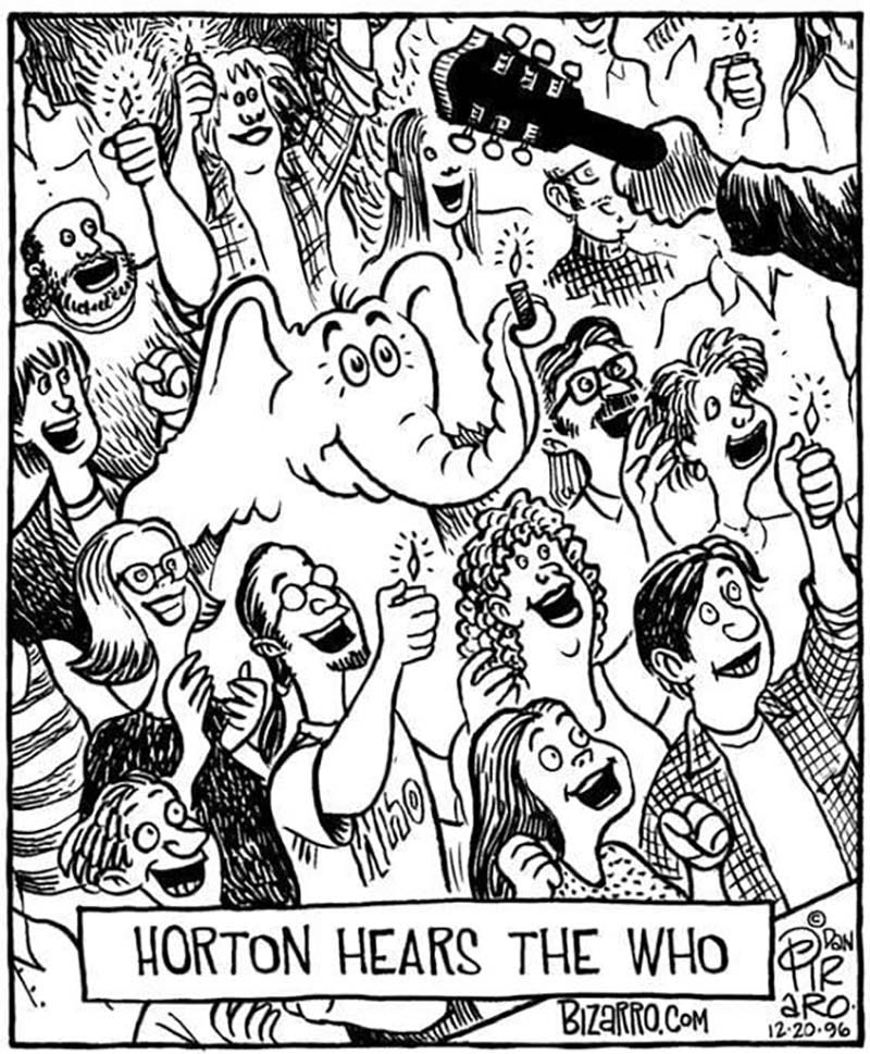
. Although I felt that Rubin’s execution of that gag was far superior to Piraro’s, I added that Piraro is an excellent cartoonist whose strengths I hoped to highlight in later posts. Today I begin to deliver on that intention—and, in the process, I will highlight how how Piraro’s work here succeeds where others I’ve critiqued in recent months have been less successful.Feast your eyes on this strip (nearly 30 years old, from 1996):
Why is this one-panel gag so well executed?
The gag itself is of course is a play on the title of the second of Dr. Seuss’s two books about Horton the elephant, Horton Hears a Who!1 The Whos in this story are a population of microscopic people living on a speck of dust floating through the air. Seuss later reused the Whos in How the Grinch Stole Christmas! Piraro’s gag is that Horton has come to hear the British rock band the Who, expertly suggested by the barest detail: the guitar headstock and neck in the hand of the onstage guitarist (presumably Pete Townshend).2
Piraro’s skill is showcased, above all, in how this image, though jammed with content, is lucid and uncluttered, and how effortlessly he highlights the two most important elements in the panel: a) Horton himself and b) the guitar neck and the hand holding it.
Piraro highlights Horton and the guitarist by shrewd use of visual density, and specifically by stand-out patches of light and dark amid what is otherwise a sea of remarkably well-distributed medium-density information. Horton, positioned in the most prominent location (upper left center), is by far the largest patch of white, while the guitar head and neck, and to a lesser extent the guitarist’s jacket sleeve, are the largest dark patch. In fact, the guitar head and neck are the only solid black. Horton’s ears and fact aren’t the only white area, obviously, but other white objects are smaller, decentered, and/or incompletely rendered. In a sea of linework, textures, and hatching, the eye is drawn to these high-contrast patches. (Contrast a Mannequin in the Moon strip I critiqued for not adequately highlighting the speaker of the dialogue caption.)
Notably, Piraro structures his composition with Horton centered and the guitar neck and hand in the upper right-hand corner. Thus, we see first Horton and then a glimpse of the Who, matching the caption text.
How does Piraro avoid the rest of this complex image becoming cluttered and illegible—particularly at smaller sizes? Partly through appropriate simplification, but also through judicious use of a technique called haloing, i.e., clearing the space around foreground objects by leaving more distant objects incompletely rendered.
The most striking use of haloing is how the guitar neck and hand in the extreme foreground are completely isolated from all background objects—as if the guitar and the arm holding it were enveloped in light.3
Note, also, how the two incompletely rendered faces below the guitar neck (the very enthusiastic woman with long straight hair and the man with glasses and sideburns) don’t touch anything else, and how lines of the plaid shirt of the man directly behind Horton don’t quite come all the way down to touch Horton’s head.
The haloing usage isn’t indiscriminate. The two men to the left from Horton (the balding, bearded man and the shaggy-headed young man in front of him) are fully rendered to the edge of Horton’s right ear. That’s because Horton’s ear is a simple, solid white flap, providing all the visual clarity we need. If Piraro tried to finish drawing the incompletely rendered faces under the guitar neck, the image would become cluttered and difficult to read. Likewise, if the plaid shirt came all the way down to Horton’s head, would we be able to read the tuft of hair atop Horton’s head?
Crucially, for me, Piraro has captured the feel of Dr. Seuss’s work with a high degree of stylistic verisimilitude; at least, nothing jumps out at me as “off,” the way that cartoon-character cameos often do.4 In particular, Horton’s cheerful expression is vital to the strip’s success.5 There’s no subversive edginess, like Dr. Seuss’s angelic elephant is secretly some kind of bad boy, nyuk nyuk nyuk. Horton holding up the lighter in his trunk is a nice visual rimshot, the “finish” of the joke.
What about the other concert goers? In my other post I criticized the relative realism of Piraro’s drawing as detracting from the gag. Should the other concert-goers also evoke Dr. Seuss style? No—no they shouldn’t. The gag depends on Horton being in our world. If he were in Seuss-land, he wouldn’t be hearing the actual Who, but, I dunno, the Who-Who, or something.6
The gag itself is bulletproof. Unlike, say, a similarly allusive It’s a Wonderful Life–themed cartoon I critiqued around Christmastime, which becomes less and less satisfying the more you think about it, this comic is a perfect marriage of inspiration and execution, image and punchline. It may or may not suit your sense of humor, but it’s the perfect version of itself, which is all we can ask of any work of art!
Read more comics writing >
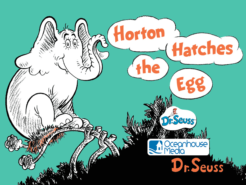
Horton’s first appearance is in Horton Hatches the Egg. Horton has two catch-phrases, one from each of his books: “I meant what I said and I said what I meant / An elephant’s faithful, one hundred percent!” (Horton Hatches the Egg) and “A person’s a person, no matter how small” (Horton Hears a Who!). The second slogan was intended to express solidarity with “the smallest” in society, those with no “voice,” e.g., the poor, immigrants and refugees, etc. For pro-life advocates, “A person’s a person, no matter how small” has had obvious pro-life resonances, particularly in the context of an elephant also known for doggedly caring for embryonic life. Seuss’s widow, Audrey Geisel, objected to this application, and threatened to sue a pro-life organization using the line in their branding. It still seems a reasonable application to me.
The diagonal line in the lower right indicating the edge of the stage locks in the canted camera angle implied throughout the panel, and further establishes in space where the guitarist is in relation to the crowd.
The only actually glowing objects in the panel are the lighter flames, where rays of light are represented by little lines radiating from the flames as well as by appropriate haloing around the flames. (These light-ray lines are whimsically called “solrads,” a term popularized by Mort Walker.)
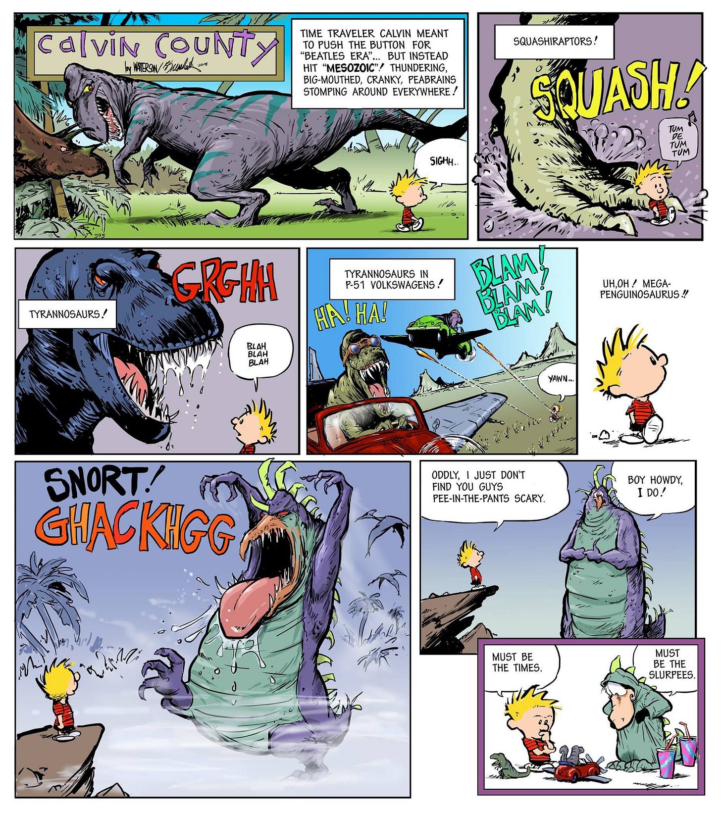
I don’t know that I’ve ever seen a drawing of Calvin and Hobbes by anyone but Bill Watterson that felt to me persuasively like the master’s work. I don’t know what exactly Watterson’s contributes to his occasional (and quite charming!) collaborations with Bloom County creator Berkeley Breathed, but that certainly isn’t his brushwork.
Significantly, everyone else at this Who concert is as a) cheerfully enthused as Horton and b) paying no attention to the literal elephant in the room. Horton is a longsuffering character often surrounded by cynics and bullies whose attention is typically directed at him. Part of the charm of this strip is seeing him at a rock concert, simply in his element and among his tribe. I like to think that both Dr. Seuss and the members of the Who would appreciate this idea and this strip.




A great cartoon, for all the reasons you stated. And as both a Dr. Seuss reader as a child, and a fan of The Who, a great visual gag!
"the Who, expertly suggested by the barest detail: the guitar headstock" - Well, that and the "Who" t-shirt front and center! :-) Of course, it's perfectly normal to wear a band shirt to a concert. But since it's only slightly separated from the name of the band in the caption, it feels a bit on-the-nose. In any case an excellent comic.
Breathed's Watterson-imitation comics have improved greatly over the years, as his art skills have grown. He's also always managed a better Hobbes than Calvin. I think it's about 25% proportion and about 75% angles. His Calvin here has *almost* the right proportions (especially the last one), but he's placing the character at angles that match his drawing style, rather than Watterson's. The one in the lower left barely looks like Calvin, due to this.
I'm just very glad that Watterson and Breathed have gradually formed a respectful friendship! :-) I'm under the distinct impression that, while Breathed has always respected Watterson, the feeling wasn't mutual, early in their careers. Prime example being: https://i.redd.it/h92w721sb9901.jpg