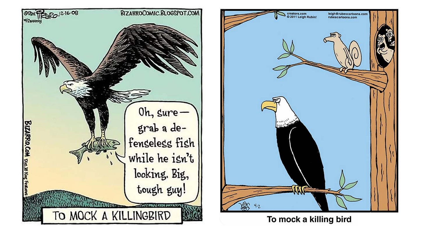
For this second installment of Cartoon Critic posting (following an enthusiastic analysis of a “Far Side” strip that’s been popular with readers), I’d like to play a game of “This vs. That.”1 Above are two one-panel versions of the same gag, both by talented cartoonists whose work I appreciate. The one on the left was published in 2008 by Bizarro cartoonist Dan Piraro; the one on the right was done in 2011 by Rubes cartoonist Leigh Rubin.2 What I want to do here is highlight the virtues that make Version 2 (the Rubin version) far superior to Version 1 (the Piraro version).3 This is of course no slight to Piraro, whose excellent work I hope to highlight in many future Cartoon Critic installments!
The gag itself is, of course, a modestly clever bit of wordplay, a twist on To Kill a Mockingbird. The question, then, is: Which execution ekes more humor setting up the punchline caption?
The first, most obvious thing that will strike most viewers comparing these two images is that Version 2 gives us a funny picture, and Version 1 doesn’t. The squirrel on the branch doing a goofy impression of the eagle’s pose looks funny; the fish verbally sassing the eagle doesn’t. The goggle-eyed reactions from the riotous squirrels in the tree hollow (a comic Greek chorus) add to the visual humor, as does the mock solemnity of the clowning squirrel on the branch—which in turn makes the stately bearing of the eagle, which would not otherwise be funny, funny.
Bill Watterson, creator of Calvin & Hobbes, has noted:
The best comics have funny writing and funny drawings, but sometimes the strength of one can make up for the weakness of the other. Great writing will save boring artwork better than great drawings will save boring ideas, but comics are a visual medium, and a funny picture can pull more weight than most people think.4
The panel art in Version 2 creates a funny scenario even before you get to the punchline caption. The scene is instantly appealing, combining satire with edgy daring. Silently mocking someone behind their back is one of the oldest gags in vaudeville and cinema; here it has the added edge of the squirrel daringly mocking their great predator—literally going out on a limb for the sake of a gag, as if taking a dare from the squirrels in the tree.
In Version 1, there’s nothing witty or funny about the fish’s jeers in themselves; they exist solely to set up the punchline caption.5 They don’t “work” as storytelling or characterization. A fish that survived a close call might sass the raptor that tried to snatch it, but a fish that’s actually a goner?6 I’m not feeling it, are you?7 It feels anticlimactic and pointless.8 Even the eagle doesn’t care.9 In Version 2, by contrast, you get the feeling that if the eagle were to catch a glimpse of his mocker out of the corner of one of those eagle eyes, he would be highly miffed, to say the least.10
The humor of Version 2 flows from the comic drama of the scenario, which extends beyond the snapshot moment of the panel itself. The scenario implicitly reaches both backward and forward in time: Moments earlier, the squirrel on the branch was whispering “Okay, you guys, now watch this”—his buddies perhaps egging him on—and then creeping oh-so-silently out onto the branch. And then, of course, what will happen next? The middle squirrel, who seems to be trying to muffle a laugh or stuff its paw in its mouth, is a big factor here. His expression says at once “Oh snap! Oh dude! I can’t believe he’s going there!” and also “Mustn’t laugh! Mustn’t laugh!” Because, of course, if they laugh, their friend might be dead.
Cartooning style is unavoidably a factor. Compared to the flat, stylized look of Rubin’s simple, cartoony art, the relative realism of Piraro’s hatchy,11 illustrative style—lovely in itself, and often a strength—works against him here. Version 2’s eagle and squirrels are cartoon characters with personality and recognizable emotion; Version 1’s naturalistic eagle is just a predator, and the realistic style underlines the direness of the fish’s fate: He’s talking trash like he’s in a Triumph the Insult Comic Dog–style sketch, but he’s actually in something closer to the world of a nature documentary. Or at least the world of Mark Trail.
In my debut Cartoon Critic piece, I highlighted the complexity and layered storytelling of Gary Larson’s tale of Edgar and the werewolf, and the notably large number of cartooning conventions employed in the service of the gag. The success of that strip is the exception that proves the rule—the rule being that in gag cartoons simpler is better. The well-known writing advice of William Strunk, Jr. applies here, mutatis mutandis:
Omit needless words. Vigorous writing is concise. A sentence should contain no unnecessary words, a paragraph no unnecessary sentences, for the same reason that a drawing should have no unnecessary lines and a machine no unnecessary parts. This requires not that the writer make all his sentences short, or that he avoid all detail and treat his subjects only in outline, but that every word tell.12
While it’s possible to create a successful strip with a complex assortment of any number of elements (as, again, Gary Larson masterfully demonstrates), any time dropping an element doesn’t diminish the effect, doing so will usually serve to enhance the effect. A gag that doesn’t need a word balloon or a caption is better off without it. The simpler successful execution is the better one.
And that’s it! I hope you enjoyed this Cartoon Critic installment!
I’ve done this kind of compare-and-contrast analysis in my movie writing at Decent Films for years.
Following the trailblazing The Far Side, both Bizarro and Rubes are anthology-style comic strips, with each installment featuring stand-alone stories and characters unrelated to other installments.
While Piraro got to the gag three years earlier, it’s the kind of gag likely to crop up independently in the minds of many people, and there’s no prima facie reason to suppose Rubin had seen Piraro’s strip when he made his version. In any case, my goal here is not to evaluate artistic contribution per se, but to offer a classroom-type analysis of effective use of cartooning technique.
Watterson, Bill, The Calvin & Hobbes Tenth Anniversary Book (Andrews and McNeel, 1995), p. 32.
On a minor technical note, it doesn’t help that the balloon lettering interrupts the flow of the fish’s lines by hyphenating “defenseless” after the first syllable. Hyphenization in a one-panel gag comic is usually a bad idea and almost always avoidable, but even “defense-less” would be less awkward than “de-fenseless.” Better still, just give this word its own line. I also don’t see why the balloon should be free-floating and not anchored against the right panel border, which would create a little more breathing room elsewhere.
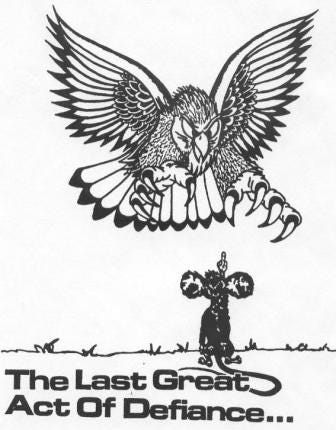
Added: Reader Brian Day brings to my attention a cartoon from the days before social media and internet memes, apparently much circulated via photocopier in workplaces and college dorms, featuring a mouse flipping the bird to a striking hawk with the caption “The Last Great Act of Defiance” (additional notes follow below):
This mouse’s panache seems to me a notable counterpoint to the limp sassing given to Piraro’s fish. The “Great Act of Defiance” cartoon doesn’t really need its caption; the image alone is striking enough. Piraro’s poor fish, by contrast, barely registers. It would be different if, say, he were saying something striking, like “You call these talons sharp? Wake me up when you get hungry!”
For some reason in my head I hear the fish’s lines in Gilbert Gottfried’s voice. It helps, but not enough.
Someone might contend that the caption “To mock a killing bird” (or “killingbird” in Piraro’s caption) requires that the bird be depicted in the act of killing. This sort of argument puts me in mind of Harrison Ford’s famous reply to Mark Hamill’s continuity concerns during the making of Star Wars: “Hey kid, it ain’t that kind of movie.” Clearly I’m the last person in the world, the very last, who can call anything “overthinking,” and yet.
On a subtle note, the fact that the fish is facing backward in the eagle’s talons prevents the fish from sassing the eagle to its face, making the attempted jeering even more ineffectual. It would also help if the eagle were a little anthropomorphized so that he could have a reaction shot: irritation, perhaps, or exasperation. Something.
There is even, perhaps, a chance that the eagle in Version 2 knows he’s being mocked behind his back, and is studiously ignoring the sassy squirrels—in which case his stern, alert look might be read as either exasperation or performative dignity. Probably not, I think, but it’s funny either way.
The textured pen strokes used throughout Piraro’s artwork are called hatching. When hatching is done with criss-crossing lines, it’s called cross-hatching.
Strunk, William, The Elements of Style: The Original Edition (Courier Corporation, 2012), p. 24.


Going to put up one defense of Piraro's comic here. While Rubin's comic is very clearly the *funnier* one, I think humor isn't the only mood the first one is running on. It's a bit of a odd mix, which I think is engaging in its own way, but I think that one is also going for a bit of the famous "The Last Great Act Of Defiance" comic (https://i.pinimg.com/736x/3d/1e/80/3d1e80f55328ad529771a9d9b3f85549--random-stuff-funny-stuff.jpg) or the Defiant to the End tvtrope (https://tvtropes.org/pmwiki/pmwiki.php/Main/DefiantToTheEnd). I also think that's why the more naturalistic style fits just fine. Sure, in both Piraro's comic and "Defiance", the eagle doesn't care a bit, but that's not the point.
Anyway, good analysis. This is a fun series.
I'd make a comment here but that would seem biased.