

Visual flow in one-panel comics: A comic-strip clinic
[How could this “Mannequin on the Moon” strip have been improved?]

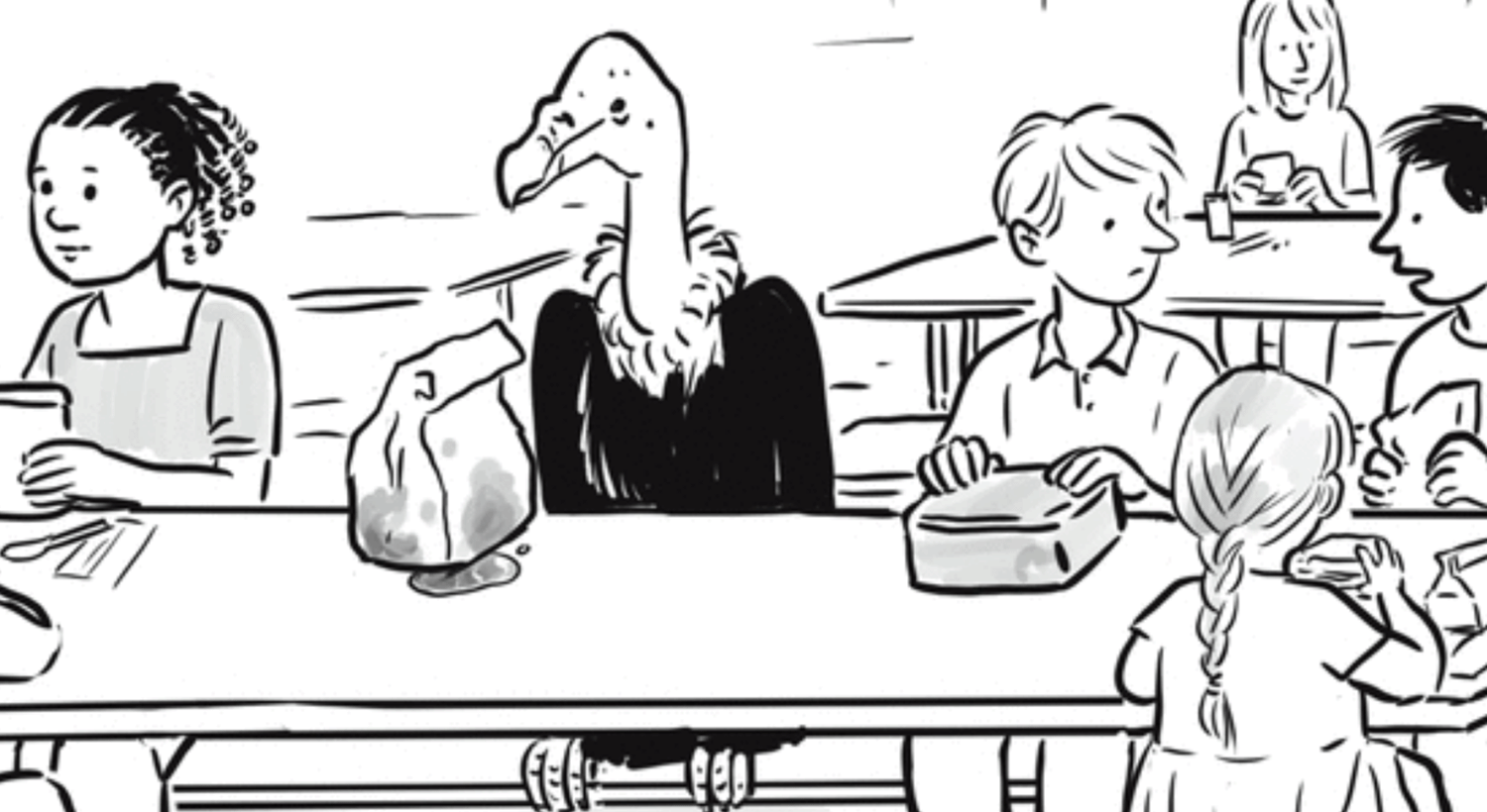
Mannequin on the Moon is a one-panel anthology strip by Ian Boothby and Pia Guerra. Their comics often feature fish-out-of-water scenarios, typically with anthropomorphic animals in the human world: a squirrel therapist with a human client; an octopus working in an office; a horse at a twelve-steps meeting. The strip below (unsigned, as is their wont) is typical of their work in this vein.

This is a fine absurdist gag, nicely drawn, with an ideal balance of naturalism and abstraction for maximum impact. For me, though, the gag is somewhat undermined by compositional choices that seem to me to interfere with the visual flow.
Why is that?
As I’ve noted before, with a captioned one-panel comic strip, typically the viewer looks a) first at the art, then b) down to read the caption, and finally c) back up at the art to reevaluate it in light of the caption. The cartoonist’s task, then, is to provide the reader in that first glance at the art with enough information to provide adequate narrative context for the caption, at least initially or provisionally. If the caption then invites us to seek additional visual information in a second look at the art, that additional information should be, if not the punchline, at least something that adds to the gag—the crucial detail, perhaps, that we perhaps missed the first time.1
With this strip, the visual focus is overwhelmingly on Jeremy himself—or, rather, in the first glance before we’ve read the caption, on the vulture (name as yet unknown!) incongruously seated in a grade-school cafeteria.

Not only is our raptor pupil compositionally centered, he’s also the largest dark patch in the piece, immediately drawing the eye to him. Looking more closely, perhaps we notice his bag lunch queasily seeping with we know not what, as we might expect a vulture’s bag lunch to do.
Nothing necessarily draws our eye anywhere else, so we glance down at the caption—not a narrative caption, but a dialogue caption. Someone is speaking.

At once we understand a) who Jeremy is and b) the obviously vital wisdom of not trading lunches with him. What we don’t yet know is who is speaking to whom. So when we glance back up at the art, of course, we are searching for where the exchange is happening. Whose mouth is open?
Oh, there he is: all the way on the right, talking to the boy in between Jeremy and the speaker.

Not exactly a Where’s Waldo? scenario, but not a great finish to the gag either. There’s no additional payoff for finding the speaker. The punchline was the caption, but the joke was undercut by not knowing where it was coming from. Almost nothing draws our attention on first glance either to the speaker or the boy he’s talking to, who occupy the easily overlooked right side of the panel.2
With a gag like this, the speaker should be the first thing we see—or, at least, a key element taken in with the first glance. This means the two boys who are talking should be centered, or on the left, and Jeremy on the right. That’s not enough: Our eye must be drawn to the speaker in a way that at least competes with Jeremy. Giving him dark hair was the right choice, but at most it’s a start.3 Perhaps he might also have a dark shirt; dark stripes might be even better. Other strategies might also be employed, such as framing the speaker in a doorway in the wall behind them. Visually calling out the second boy might also be helpful.
It might also be necessary to deemphasize Jeremy. This raises a tantalizing possibility: Perhaps the funniest version of this joke would be if we didn’t notice Jeremy until after reading the caption and then looking back up at the panel! Instead of “Who’s speaking?” we ask “Who’s Jeremy?”—and then comes the absurd visual punchline.
This would, of course, require drastically deemphasizing the vulture—which, to be fair, might not be Boothby and Guerra’s vibe! They seem to relish the unexpected presence of animals in human settings, and make it as blatant as possible.4 If they did want to go this route, the two boys should be on the left and Jeremy on the right, possibly at the second table, or even positioned with his back to the hypothetical camera. (I’m guessing that the creators considered it important that the boy getting advice—a new student, presumably—be seated next to Jeremy. This is an understandable thought, but perhaps not necessary.)5
Oh, and I would consider making at least one of the two key children a girl.6
Read more comics writing >
For a masterly example of this principle at work, see my inaugural comics post, on a classic Far Side.
In the absence of other visual cues, English-speaking viewers intuitively “read” even one-panel comics left to right and top down.
After all, another child behind the speaker has a head of dark hair approximately equal in visual impact, and there’s the girl with braids on the left.
It is important to this joke, and to other comics like this one, that the humans accept as normal the presence of the animals. Notably, no one is even looking at Jeremy. It it might be funny if an unrelated kid were carrying on a random conversation with Jeremy—but it would be crucial in that case to decenter Jeremy and the random kid so it’s very clear who the speaker is!
Let’s give Boothby and Guerra themselves an opportunity to illustrate the principle successfully with a similar fish-out-of-water gag (commentary below):
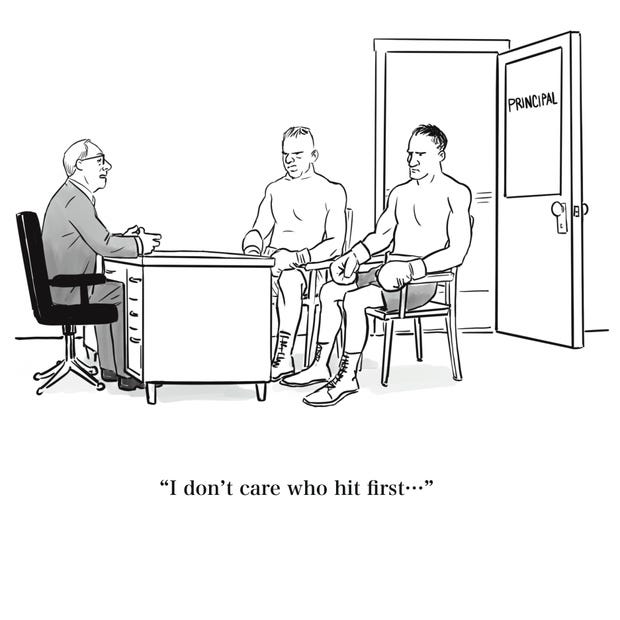
I don’t know about you, but, on first glance at the art, I registered two boxers in an office talking to a suited man at a desk (perhaps a manager or a promoter). Then I read the initially puzzling caption (is he a referee?)—and only after that, in a second look at the art, I noticed the inconspicuous lettering on the office door, and then I got the joke. That’s the correct order! Even if you noticed “Principal” on first glance, before reading the caption, it was still the last thing in the drawing you noticed, and the gag still works. (Another thing I like about this gag is that it taps into adult back-to-school anxiety dreams.)
This is going a little beyond my brief as a comics writer, but: A friend suggested that Jeremy appeared to be eying the light-haired boy on the far left (or his lunch). Au contraire! While many animals—animals with front-mounted eyes and good binocular vision, like humans, dogs, and cats—turn to face what they want to look at, most birds have side-mounted eyes and limited or no binocular vision. Birds generally turn one eye toward the object of their interest (e.g., food, a predator, a potential mate, etc.) while the other eye scans for predators or rivals in the opposite direction.
Now, a complication is that vultures are raptors—and most raptors, being predators, do have front-mounted eyes and good binocular vision. Among raptors, though, vultures are generally an exception! A few vulture species (like white-headed vultures) have good binocular vision characteristic of predators, but most vultures (e.g., turkey vultures) have side-mounted eyes and limited binocular vision.
I would guess that Jeremy is a red-headed vulture, a species with side-mounted eyes. He definitely does not appear to have binocular vision. My guess is that he’s checking out what the blond, braided girl on the right is eating.
"Oh, and I would consider making at least one of the two key children a girl."
From general inclusivity (always a fine goal), or because you think it would enhance the joke in some way? I checked the attached footnote 6, but it doesn't appear strongly related, unless you are saying that Jeremy is considering asking the braided girl for a trade, rather than the blonde boy, so the dark haired boy should be giving her advice instead?
I assume Jeremy is facing to his right because, if he was facing forward, it would make recognizing him immediately as a vulture harder. And if he was facing to his left it would make the conversation (appear) non-private, and potentially be menacing. So comic structural reasons force him to face where he does, rather than zoological reasons. :-)
But, yeah, the comic would definitely be strengthened by the rearrangements you suggest.
I'm not sure it even needs words.