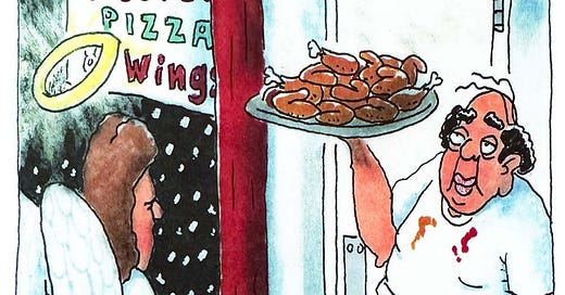
The days after Christmas Day—i.e., the Christmas season1—are when we at The Grey Havens watch Christmas movies. The lineup varies from year to year, but there are three we never miss: The Muppet Christmas Carol, Die Hard, and, of course, It’s a Wonderful Life. In this seasonally appropriate Cartoon Critic post, we consider a one-panel riff on a sentimental adage from It’s a Wonderful Life by cartoonist Dan Reynolds (Reynolds Unwrapped), best known for his work in Reader’s Digest and his greeting cards.2 Here’s the cartoon:
This cartoon, I regret to say, doesn’t really work in my judgment. This is no knock to Reynolds’s work in general (we all have off days); in any case, my goal here is not so much to highlight the strengths or weaknesses of particular artists as to explore the principles that make comics art work—or not. Understanding the mistakes that undermine comics that don’t quite work is important to fully appreciating the achievement of successful comics!
Today’s Cartoon Critic question, then, is: Why doesn’t this strip work, in my opinion?
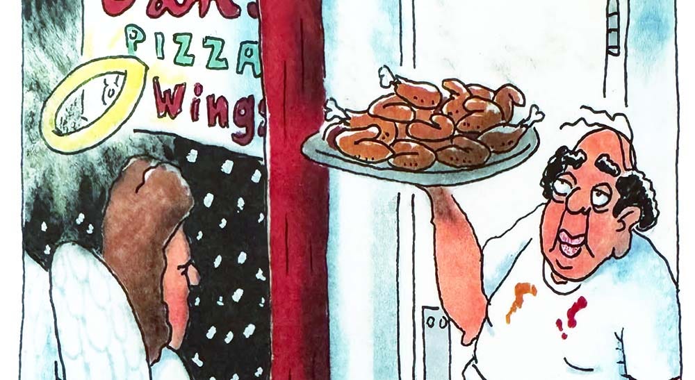
The premise is a solid dad joke: The line “Every time a bell rings, an angel gets his wings” is presented as a narrative caption along with an image of an angel ringing for service and receiving an order of chicken wings. Humor is subjective, and I’m not here to judge the comic value of the premise! My concern is with how the execution serves—or undermines—the premise.
For me, this execution undermines the premise. Here’s why:
First of all, the angel is ringing the bell, but has not yet gotten his wings. That’s a problem …
… but a more intractable problem is that he rings the bell twice. “Every time a bell rings” means every time; two rings equals two angels getting wings!3 The second ring kills the gag. Two rings, only one angel (presumably) getting wings!
Why is the angel ringing the bell at all? The sign says “Ring for service,” but it looks like the angel is already being served. No other customers are in view, so the default assumption is that these wings have been prepared for that angel.4 The gag dies again.
Finally, pitfalls of distracting extraneous details (simplify, simplify):
Is the angel meant to look irritated? There’s not much to go on,5 but, where a single penstroke for eyes can scan as enigmatic or neutral, two or more penstrokes converging toward the bridge of the nose tends to convey annoyance.6 (The stiffness of the arm ringing the bell could also be taken to suggest irritation.) If the angel is meant to look irritated, why? Is that why he’s ringing the bell—even ringing twice!—despite apparently already being served? Has he been waiting too long? Do angels get irritated waiting too long? The gag dies a third time.
The storefront sign is distracting on a number of levels. It appears to read “Cam’s Pizza & Wings,” with the ampersand awkwardly glimpsed through the halo, though not colored in like the other characters—unnecessarily cluttered and fussy. Then there’s that first name, “Cam” (at least, it’s not easy to read the name any other way). An unusual name calls attention to itself; it leaves us wondering if it’s part of the joke.7 (Why is he Cam? Is there a character with that name in It’s a Wonderful Life? Nope…) Finally, there’s the mention of pizza, which gratuitously raises the question what happens if an angel rings the bell for pizza. (Does he get wings anyway? Every time a bell rings…!) Is the sign needed at all? Does it help or hurt?8
Finally, and most glaringly among extraneous details, why does the cash register total read $6.99? In a joke about an angel from heaven, what does $6.99 make you think of? Right: 666 with the last two digits inverted.9 So now I’m squinting at the cook, wondering if there’s something slightly diabolical-looking about him10 … and thinking about the “demon hot” wings11 that Suz and I used to get at Outback Steakhouse, and … and … and the gag is (to invoke another Christmas tale) dead as a door-nail, and all that that implies.
An ideal cartoon isn’t necessarily the best cartoon in the world. It’s enough that a cartoon be the best possible version of itself, the best execution of the premise. This strip misses the mark for several reasons. It should have gone through another round of brainstorming in search of the best execution.
How might the gag be salvaged? Consider a version of this cartoon with two angels: one in a “Pick Up” area receiving previously ordered wings at that same moment that another in an “Order” area rings for service—just one ring, of course! Just a thought. What do you think?
Read more comics writing >
Christmas is a) one day, b) eight days (the Christmas Octave, ending on January 1, the Solemnity of Mary, the Mother of God); c) the famous “twelve days,” ending on January 6 (the traditional date of Epiphany); and d) for Catholics, an indeteterminate season ending on the feast of the Baptism of the Lord, which this year falls on January 12, 2025. There are even longer schemas!
A Catholic, Reynolds also has a line of religious artwork.
This is not just my personal interpretation of the line! If you’re familiar enough with It’s a Wonderful Life (and the falling snow is another indication that we’re meant to think of the Christmas classic), you immediately think here of Nick the barman, in the alternate Pottersville world, repeatedly ringing the cash register just for fun: “Get me—I’m giving out wings!” Every time a bell rings!
Even on the off chance that the wings are for some hypothetical out-of-frame customer, the angel would then not be getting his wings!
To use language borrowed from the theater, the angel is facing three-quarters left with its face in a mostly closed or hidden position.
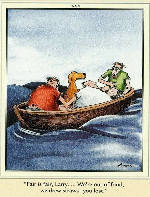
The single-penstroke approach to drawing eyes is characteristic of Gary Larson’s The Far Side. For a typical example, consider the expression on the face of the dog in this strip. (Commenting on this strip, Larson wrote, “Many times in drawing faces, I find that it’s the understatement of an expression that is so very vital to the humor.… I wanted [the dog] to look confident and a little smug, but not elated.”)
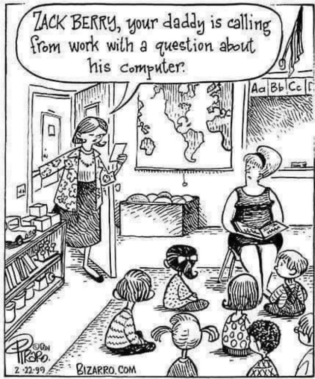
Here’s another example of a cartoon undermined by a distractingly specific name: “Zack Berry” (whose name is written in smallcaps, further emphasizing it) seems at first like it should be significant to the joke, though I don’t think it is—and by the time you decide the name doesn’t matter, the damage is done. (That “Zack Berry” rhymes with “BlackBerry,” in a tech-themed joke, is, I think, an accident of history, as the BlackBerry brand was not a household name in 1999.) It would be better to have the woman at the door (a school secretary, perhaps) simply calling Zack by his first name.
For discussion of how a small, simple evocation of a store (in this case a gun shop) can work without a sign, see my first Cartoon Critic post.
$7.77 would have had a nice theological (ahem) ring to it. It’s a reasonable conceit that an angel might order exactly $7.77 worth of wings. $6.99 is simply the wrong price for wings in this strip.
Darn it, now I’m thinking that the cook looks not entirely unlike a balder, uglier Nick from It’s a Wonderful Life!
To pick one last nit: The knobby bone ends make the wings look less like wings than drumsticks and legs. Admittedly, it’s hard to draw chicken wings properly and make them look like meat at all, but sometimes you just have to trust the audience.


This is a weird one. Is there a "Hey kid, it ain't that kind of movie" for comics? Yeah, it definitely falls apart on analysis. But it's the kind of comic where you're "supposed" to simply glance at it, go "oh. ha." and then move on.
My problem with it is different though. I don't even get to the analysis stage. Or even the "oh. ha." stage. Because there's something so off-putting about the art. It looks like someone took a Far Side comic and and ran it through some kind of AI ugly filter. It's *really* ugly. So much so I have trouble even sparing attention to parse the joke. Very strange.
You have the most discerning, comic, reading eye ever! Very impressive!