

Here be dragons!
[three behemoth-based cartoons from Mannequin on the Moon]

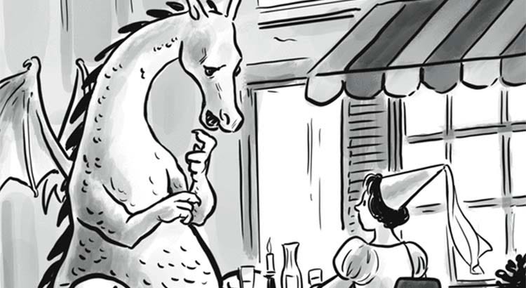
The last time I posted a one-panel comic strip from Ian Boothby and Pia Guerra’s Mannequin on the Moon, it was to highlight what I considered compositional mistakes that undermined the gag. Here’s a strip from the same talented people that I think works better!

The punchline here is a type of wordplay that turns on literalizing a metaphor. At the same time, the humor lies as much in the funny drawing as in the punchline. This kind of fish-out-of-water sight gag is very much Mannequin on the Moon’s stock in trade, and this vignette offers a great example. The picture would be funny by itself; the punchline exists as much for the sake of the drawing as vice versa. (I discussed this dynamic not long ago.)
Many Mannequin on the Moon strips put one unexpected, out-of-place figure in a mundane human setting (a vulture attending grade school; a bear working as a sushi chef; a parrot doing stand-up comedy). In a Mannequin strip, I wouldn’t be surprised to find a dragon having dinner at a (French or Italian?) café with a regular person in modern attire. Keeping the relatively modern setting, but making the dragon’s dinner date a princess, is a great unspoken visual gag. The level of realism and stylization serves the humor perfectly: The dragon is realistic enough for his body language and expression to be specific and funny, while the princess is stylized enough (from her puff sleeves to the decorative tip veil of her steeple hennin) to be an archetypal fairy-tale princess.
The café, too, has just enough detail to sell the scene and not too much to be distracting—not too overdrawn1 for the caption, which is a dumb but funny joke given its best presentation. (The caption itself is calibrated just right. Just enough to establish the premise, the tone, and get us to the punchline without unnecessary fuss.)
I appreciate that the artist chose to depict this odd couple dining outdoors, and the aesthetically pleasing curl of the dragon’s tail. Offsetting the couple so that the princess is more centered and the dragon more marginal, and positioning the table in front of part of the dragon’s body while seating the princess in front of the table, helps to balance the composition, with a crucial assist from the striped awning. Through thoughtful use of wash and smart compositional choices, the artist exploits the contrasts of light coming from the window and the dimness of the evening; the illuminated dragon pops against the slightly darker background, and the princess’s face is highlighted against the shutter.2
As a counterpoint, here are two more Mannequin on the Moon strips featuring draconian beasts that I think are less visually interesting and successful.
For what it’s worth, I actually wrote the commentary for the café cartoon before running across the strip below, featuring a dragon with back problems. Still, putting the dragon inside a doctor’s office perfectly illustrates my point about the merits of the above cartoon seating our diners outside. When have you ever been in a doctor’s examining room with ten-foot ceilings and that much floor space?

This is a fine (and comparatively relatable) gag, but the flat composition and perfunctory use of wash adds little. Of course lighting in a doctor’s office is never going to be as attractive as a candlelight outdoor dinner, but art must find a way! The dragon’s expression is suggestive, but I’d like to see more humor in his body language. (Note that the offsetting I praised in the café cartoon is missing here; the composition is off balance, though the cabinetry and display spine help.)
This third strip below also has a clever gag, with imaginatively drawn beasties, but not much thought put into the composition. I think a higher camera angle and a longer shot, emphasizing the emptiness of the waters around them, would have made this gag funnier. One good touch: The monster speaking is holding a map but looking around, taking in the deadness of the scene.

See also
What does an overdrawn cartoon look like? I’m glad you asked! New Yorker cartoonist Trevor Spaulding is a good artist and a good cartoonist who doesn’t always go overboard like this. I half suspect that, the more mundane the subject and the simpler the gag, the more he feels compelled to dress it up with quality art, which isn’t the right move. (Commentary below.)

What exactly is wrong with the drawing? As a drawing, nothing—it’s lovely work! I particularly appreciate the articulation of the underside of the umbrella, the latticework on the gate, and the short ponytail under the baseball cap snapback. The main problem, of course, is that it’s so detailed and naturalistic that it distracts from the punchline which, in theory, it’s meant to serve.
Among other things, the posture and body language of the blond woman are too expressive to be irrelevant, yet they are irrelevant. From this three-quarter right view we can’t see her expression, which, in a better execution—a reaction shot, probably in right profile—would be the finish to the joke. (By contrast, the princess in the Mannequin cartoon, seen in exactly the same three-quarter right view, works just fine; her reaction shot would add nothing to the gag.)
Aesthetically, I appreciate this three-quarter view more than I would the right profile that would have served the punchline better (the single greyscale brushstroke defining the lower edge of the blond woman’s mandible is more visually interesting than her expression would have been). As it is, though, my impression is that the artist was more interested in the drawing than he was the joke, which is not what cartooning is all about.
If I had to pick a nit—and this is a tiny, fussy detail—I would say that in a borderless cartoon like this, the cropping should never allow a solid object to sit right on the implied panel border. So I have a tiny problem with the three or pen strokes, pretty much on the implied bottom border, establishing the exterior ground line of the café and the bottom of the planter. Either just drop the three lines, hypothetically cropping it a millimeter higher, or raise the three lines a quarter inch so that the ground continues comfortably in front of the building. I do not mind the dragon’s winding tail lying on the implied panel border, because it’s winding.
Delightful entry!
I always enjoy your cartoon analyses.