


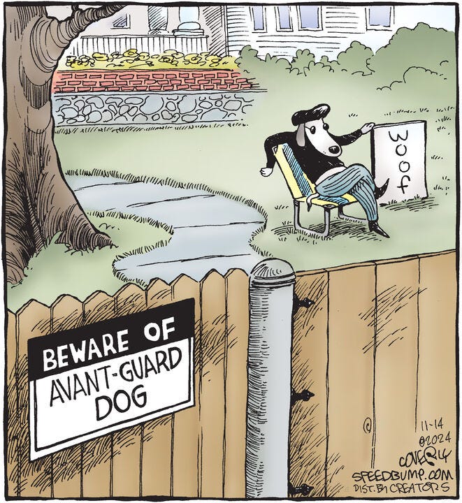
Woof: Speed Bump’s ‘avant-guard dog’
[a favorite from cartoonist Dave Coverly]


Dave Coverly’s one-panel anthology strip Speed Bump often focuses on dogs and cats. One of his favorites is this rerun from, I believe, 1998.
Thoughts:
This strip is a pun gag (“avant-guard”) that, crucially, doesn’t stop with illustrating the pun.1 The humor turns on the interaction between the wordplay on the sign and the dog’s over-the-top beat-poet vibe. Everything about the dog is funny, from the lounging pose and the languorous set of his downturned snout to the perfectly appointed accoutrements (beret, elegantly suggested shades, black mock turtleneck, cigarette pants, pointy winklepicker shoes). The dog would be hilarious even without the sign on the fence.
Somehow the fact that the letters in woof are set vertically rather than horizontally is, for me, the funniest thing about the strip. Like the unorthodox typography of beat poetry, the sign format makes the medium itself part of the aesthetic. It’s as if (in a turn of phrase I read somewhere) the dog were saying, “This isn’t just a woof, man. This is art.”
I admit I’m conflicted about the spelling “avant-guard,” which feels a little awkward to me. Part of me thinks the gag would be better served just going with “avant-garde” and letting viewers work out the pun for themselves. But perhaps not. A certain level of subtlety can be a virtue in cartooning, but you don’t want to lose even one viewer in five. (One in ten might be okay.)
I feel like the strip wants a pedestrian on a sidewalk looking at the sign on the fence, with their implied confusion or curiosity adding another layer to the gag. For some reason I imagine Gary Larson doing it that way in The Far Side. (Oh hey, I know why I’m thinking that: Larson’s classic “Beware of Doug” strip, of course!2)
The artistic style fits the gag very well, and the drawing is generally solid.3 The tree, in particular, is lovely. My one misgiving is the house, which seems to me distractingly overdrawn, not to mention ostentatious. Is there a reason for layers of stonework and brick (and every individual brick4 outlined in full5)? And then a porch with a double row of pillars?! Does a McMansion vibe help the gag?

I’m not saying I would prefer to see Mr. Avant-guard in, say, a loft apartment in Montmartre or a basement studio in Noho—though certainly that’s where he thinks he should be. Part of the humor is doubtless the jarring contrast between our poet’s bow-wow-hemian6 vibe and his regrettably conventional setting. Still, a less distracting suburban house might have better served the purpose. Anyway. Good strip.
What does a comic strip look like when it illustrates a pun and does nothing else? Here’s an uninspired example from Canadian cartoonist Dave Whamond.

The man is a stone cold genius.

Very minor technical note: The edges of the grass on the walk should not be drawn with identical line strokes on both sides of the path, and in both curved directions. (Not worth explaining further; if you see it, you see it.)

Suggested brickwork is often a better solution than drawing every brick. It’s unfair to keep turning to The Far Side, but watcha gonna do?

That said, drawing every brick can be a solution. Especially if you are Will Eisner. Then do whatever you want.

I am very sorry and I promise never, ever to do this again.
Regarding your conflict, my own first thought was, why not "avant-garde"? To me, it would be a better fit.
6: No you aren't!