Cartoon Critic #1: A Shocktober “The Far Side” commentary
[Gary Larson’s tragic tale of Edgar, a werewolf, and an obnoxious tie]
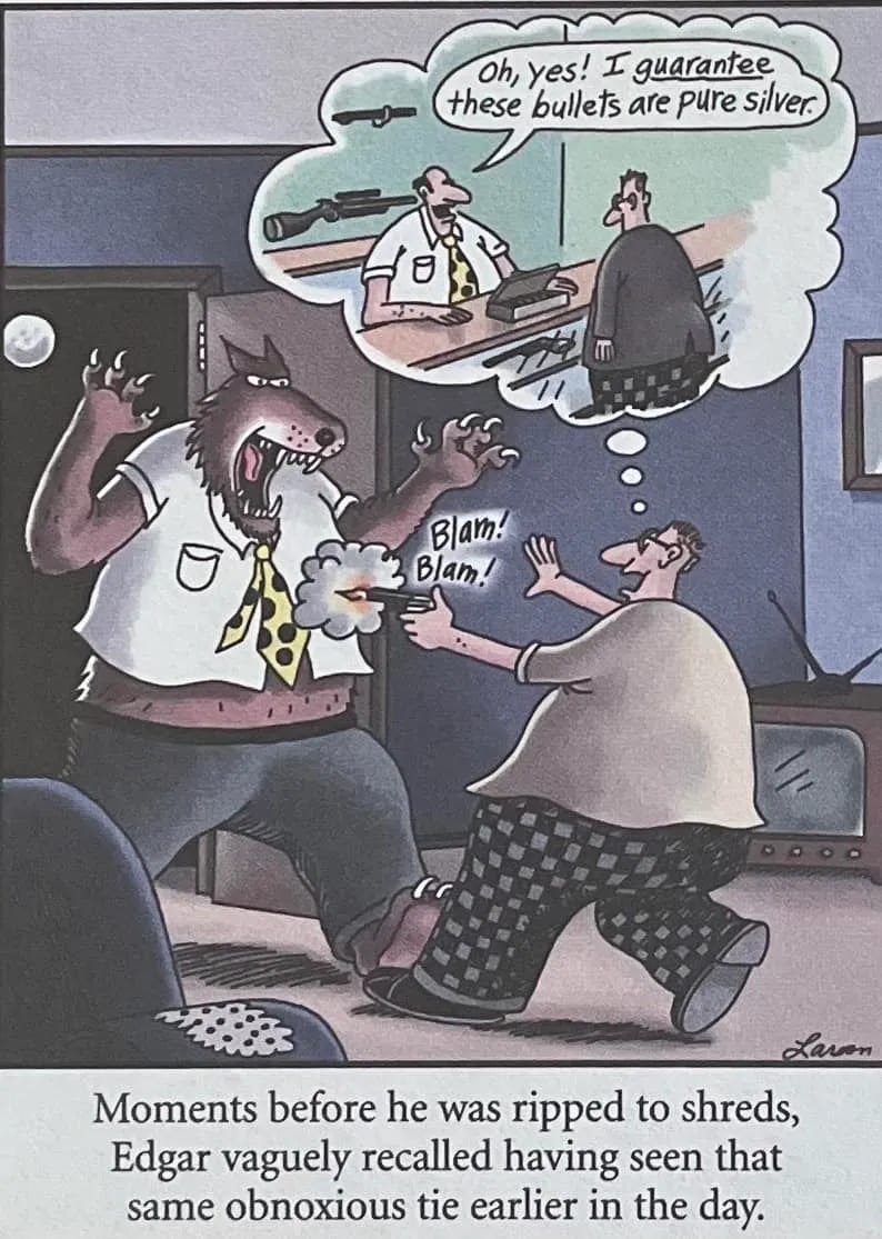
To kick off comics writing here at Dailies & Sundays, I thought I would start with an outstanding one-panel strip1 about which I have nothing (almost) but praise—and, given the imminence of Halloween, I think this classic from Gary Larson’s The Far Side is a perfect place to begin!2 Before reading my commentary, take a moment to position the image below so that you can see the whole thing on your screen, including the caption, without scrolling, and then just take it in in all its brilliance.
Above all, this is a great gag and an ideal expression of Larson’s peculiar sensibilities. The most notable thing about this particular strip, though, is the unusual complexity of the storytelling and marshalling of a remarkably large number of cartooning conventions. In a single panel, Larson includes:
a narrative caption;
an in-panel sound effect (Blam! Blam!);
a thought bubble, containing
not words, but a flashback image;
a speech balloon within the thought-bubble flashback (a balloon within a balloon!);
as well as, of course, the narrative elements of the main panel itself.
Yet it all reads clearly, and the visual progression or flow—one of the most important considerations in cartooning—is unmistakable, and remarkably layered.
How does this work? Unlike animators, or filmmakers in general—who have direct control of the flow of visual information to the viewer—cartoonists must rely on convention and visual strategy to unfold their ideas to the viewer in the proper order.
With a multi-panel strip (or with a comic-book page), for example, readers are meant to follow the same basic reading-order rules as their written language. Comics created for readers of English and other languages that follow left-to-right, top-down reading order are structured with panels (and balloons within panels) meant to be viewed or read in approximately the same order (with variations and exceptions). Japanese manga, and other comics created for readers whose written language is right to left, likewise use right-to-left panel order and balloon order.
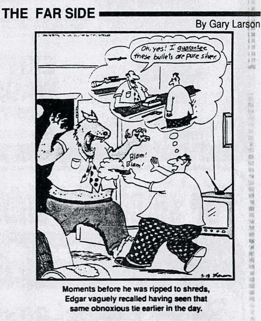
This Far Side strip, though, is a one-panel daily strip (originally printed in black and white, though it’s been redrawn and colored for reuse in other media).3 There are few clear conventions to tell the reader what to look at first. In principle, a reader could choose to read the strip from the top down; or they could read the caption before looking at the picture. Either of these approaches, though, would undercut the gag, which depends for its maximal effect on a specific visual flow—through which Larson capably guides us, as follows:
The viewer’s eye is naturally drawn first of all to the dramatic elements at the center of the panel—i.e., the ferocious face of the attacking werewolf and Edgar’s desperate plight (Blam! Blam!).
From there, we glance up to the picture in the thought bubble …
… and up again to the word balloon within the thought bubble—quickly inferring the fatally misleading sales pitch and a general sense of the shape of the joke.
Only then do we look down to read the caption—which unexpectedly redirects our eye …
… back up to the werewolf’s necktie and …
… up again the necktie in Edgar’s memory of the salesman, spotting the matching pattern we hadn’t noticed initially. (Before reading the caption—the first time we took in the flashback image—we understood that the salesman had misled Edgar, but not necessarily why. Maybe he was just a shady salesman passing off cheap imitation silver bullets as the real thing! Ah, but no, the tie gives it away.)
All that in a one-panel cartoon! It’s amazing, especially considering it was created to work as a black-and-white daily on a few square inches of newsprint. How does Larson do it?
The narrative clarity is aided, to begin with, by expert use of composition, most crucially parallel blocking in the main panel and the thought bubble. That is, in both images the werewolf and Edgar stand in the same relationship to one another and to the hypothetical camera. This key choice allows the viewer to easily mentally superimpose one over the other: The customer is Edgar; the tie is the tie; the salesman is, etc.
Another important feature is shrewd simplification of visual elements to the bare minimum (or something close to it). Larson includes just enough descriptive detail to sell the story:
The guns on the wall behind the salesman and behind the glass front of the counter are all we need to recognize that Edgar is in a gun shop and the man behind the counter is the salesman. (We don’t need, say, a store window with “Gun Shop” in reverse lettering, or a sign on the wall behind the salesman, etc. That kind of visual clutter would harm the strip’s legibility, especially at smaller sizes.)
On a bit of a technical note, the simplicity of the gun shop depends in part on the suggestion of one-point perspective, with the angling of the counter case and the case behind the salesman helping them to read clearly. This choice comes with a potential risk: Any significant use of perspective in Edgar’s living room, whether similar or different, could create visual dissonance. Larson, though, avoids this by using something close to zero-point or flat perspective in the main panel elements. That is, all horizontal lines from the baseboard to the ceiling molding are very nearly horizontal, with the hypothetical camera positioned as neutrally as possible. Thus, no dissonance!
Despite the relatively flat perspective in the main panel elements, Larson creates a pleasing sense of depth and visual drama with the easy chair in the foreground and the television behind Carl—both cropped by the panel borders, and both cropping or cropped by the main figures. (The partial hiding of the werewolf’s left paw behind Edgar’s left foot and leg also contributes to this effect.)
The doily on the arm of the chair helps to sell it as a chair with minimal detail. (At the same time, that chair arm, if you look at it closely, is a problem. Of course you aren’t meant to look at it closely—but if you do, it doesn’t make sense; at least, I see no way to draw the rest of the chair so that it makes sense. It looks like the kind of mistake we sometimes see today in AI art. And that’s my only real criticism of this strip!)
Edgar’s checkered pants, which might have been too fussy a detail in the hands of a lesser artist, help both to emphasize the gesture (on which see below) and to seal his identity with the otherwise nondescript figure on the right in the thought bubble. (I’m not sure there’s a good reason for Edgar in the flashback to be wearing a jacket with a vent, but it doesn’t matter much one way or the other.)
It’s perhaps worth explicitly mentioning that, while Larson’s drawing style is rather basic compared to, say, the virtuoso work of cartoonists like Wiley Miller (Non Sequitur), Bill Watterson (Calvin & Hobbes), or Berke Breathed (Bloom County, etc.),4 the man can draw5—and his work is significantly more artful and sophisticated than that of some notable cartoonists (say, Stephan Pastis of Pearls Before Swine) whose output relies more on quality writing than quality drawing.
Look at the gesture (the posture and naturalistic sense of body movement in space) in the depiction of Edgar, stepping backward and leaning defensively away even as he futilely tries to defend himself with an upheld hand as well as the (tragically falsely marketed) bullets. The gesture of the werewolf isn’t as nuanced, but in a way the very stiffness of his stereotyped posture adds both to the drama and to the humor: This is not an individual, or anything in any way ambiguous, but a creature-feature monster whose intentions are crystal clear and exactly what you’d expect. (Raaaahhh!)
Finally, the caption itself adroitly shifts in tone from the lurid, Addams-esque or Gorey-esque violence anticipated (but significantly not delivered) by the panel’s main image to the banality of the observation (down to the choice of the prosaic adjective describing the tie) that makes for the strip’s punchline and the unstated revelation that poor Edgar was set up from the beginning.
That inference, which Larsen leaves for us to draw, is the final key to the strip’s success. The best short-form humor or drama relies on narrative or conceptual elements that lie outside the explicit scope of what is written or drawn. It’s the beat after the last narrative beat—the one that occurs only in our minds—that brings it all together. (This is a principle we will revisit in later Cartoon Critic installments!)
And that’s all for now. I hope you’ve enjoyed this appreciative breakdown of a great Far Side strip!
It is somewhat illogical that one-panel comics as well as multi-panel ones are called “strips,” yes. I don’t make the rules.
More Halloween monster–themed Far Side cartoons are available for your viewing pleasure at this Cracked.com piece.
I don’t have a good image of the original black-and-white newspaper strip, but here’s a bad image; notes below!
You can see that in the colorized version, beyond the reproduction being cleaner, the linework has been tidied up and enhanced:
The ceiling and doorway molding outlines are straighter and neater; the zipatone-style halftone dot pattern on the werewolf’s pants has been removed, etc.
The full moon is no longer cropped—though it doesn’t appear to have been moved. Rather, the whole image is less tightly cropped by the left panel border. This could mean either that the image was extended in the redrawing or that some philistine newspaper layout artist recropped the image to save page space—an atrocious crime against the premise of this strip, which obviously depends on the moon being full!
The salesman now has hairy arms (a detail too subtle for a black-and-white daily), and the werewolf now has beady pupils fixed on his hapless victim.
Oh, and the glass cases now have prominent diagonal “glass lines” (“the international cartoon symbol for glass”; see next image below!).
I don’t know whether the tidying was done by Larson himself or delegated, but I believe the colorized version is actually an authorized form of the comic, not a fan edit. (There are other colorized versions online, some but not all of which use the same tidied-up linework, and others of which are clearly fan edits or re-creations. The colorized version I used appears at the Cracked.com article referenced in note 1.)

All of my reference points as a comics appreciator are old.
Occasional furniture-related mistakes notwithstanding! Larson‘s drawing chops are evident in this strip regardless whether we are looking at the tidied-up, colorized version or the original black-and-white version in note 3. The tidied-up version is neater; it is not better drawn (or worse), with the possible exception of the uncropped full moon.


Amazing
Oh my gosh, I actually remember this particular comic panel from when I was a kid! I might have even cut it out and kept it for a time. It's rather dark humor, for sure, but very good, as you have explained so well. I loved reading the newspaper funnies with my mom every week. The color version looks more familiar to me but I'm not sure which I saw. It was such a long time ago. Do you know when it first appeared?