


More SDG whiteboard fun!
[Happy Fourth! Merry Christmas! Happy Easter! Happy birthday!]

Earlier this week I pulled back the curtain a bit on a Grey Havens birthday tradition of special dry-erase marker whiteboard designs, highlighting the Coraline–themed whiteboard design I did for a joint birthday celebration of our eldest and youngest daughters.
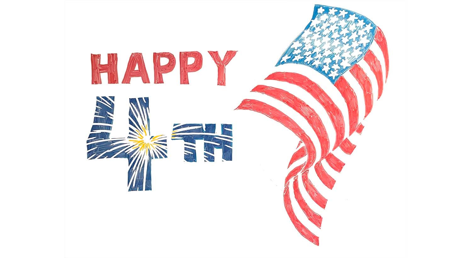
This tradition isn’t only for birthdays—I occasionally do other special days as well! Above is a simple Fourth of July design I did a few years ago. The fireworks effect in the “4th” and the stars on the flag rely on the magic of Q-tips for precision erasing. The billowing flag I drew on the fly, with no preliminary sketching or under-drawing. Not a super sophisticated design, but I’m pretty pleased with it. Happy Fourth!
Upper East Side Story
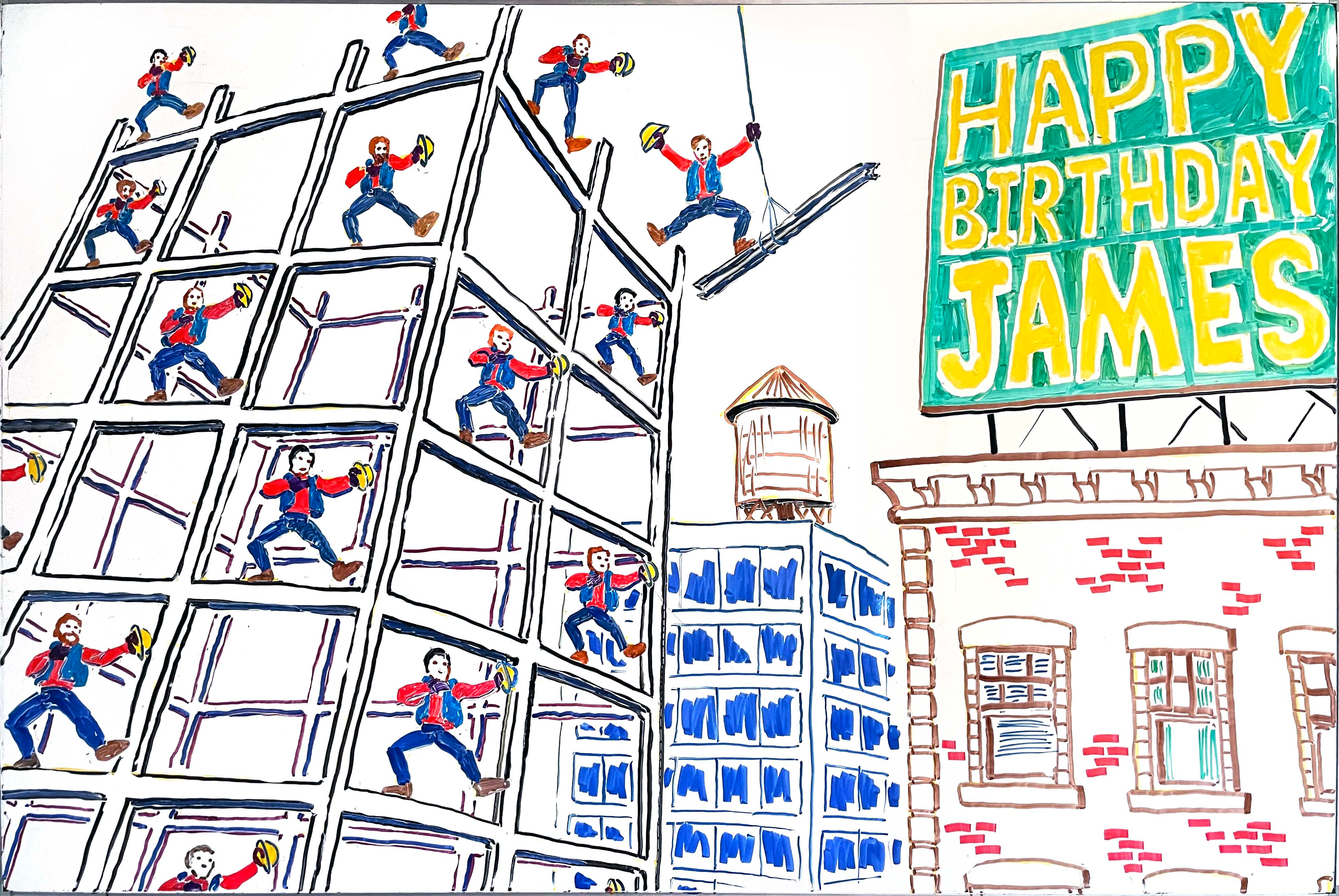
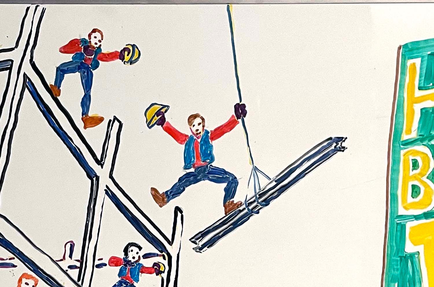
This one was done a few years ago, around the time Steven Spielberg’s West Side Story came out. At that time, James was working in NYC construction as a site safety foreman (or something like that). That’s him, of course, standing on the girder swinging from the cable.
Given his OSHA certifications, I assume that he wouldn’t really doff his hard hat in such a high-risk situation—nor, presumably, did his coworkers wear matching outfits or celebrate birthdays by bursting into production numbers. (In James’s brutally honest words, “My coworkers aren’t that thin, or for the most part that nice.”) But my birthday whiteboards have always leaned into fantasy.
In a perfect artist brag moment, at the birthday party, a guest admiring the whiteboard asked, “Is that two-point perspective?”—giving me an unexpected and delightful opportunity to explain that it’s actually three-point perspective, with the camera tipped up and the vertical lines converging toward the sky. (The perspective isn’t perfect, perhaps partly because I worked improvisationally, with no preliminary sketchwork and no detailed plan. I did do under-drawing in yellow, as you can see if you look closely. Anyway, despite a couple of irritating perspective mistakes, the overall effect is basically good enough.)
One thing about studying superhero cartooning in college: You get a lot of practice drawing urban cityscapes!
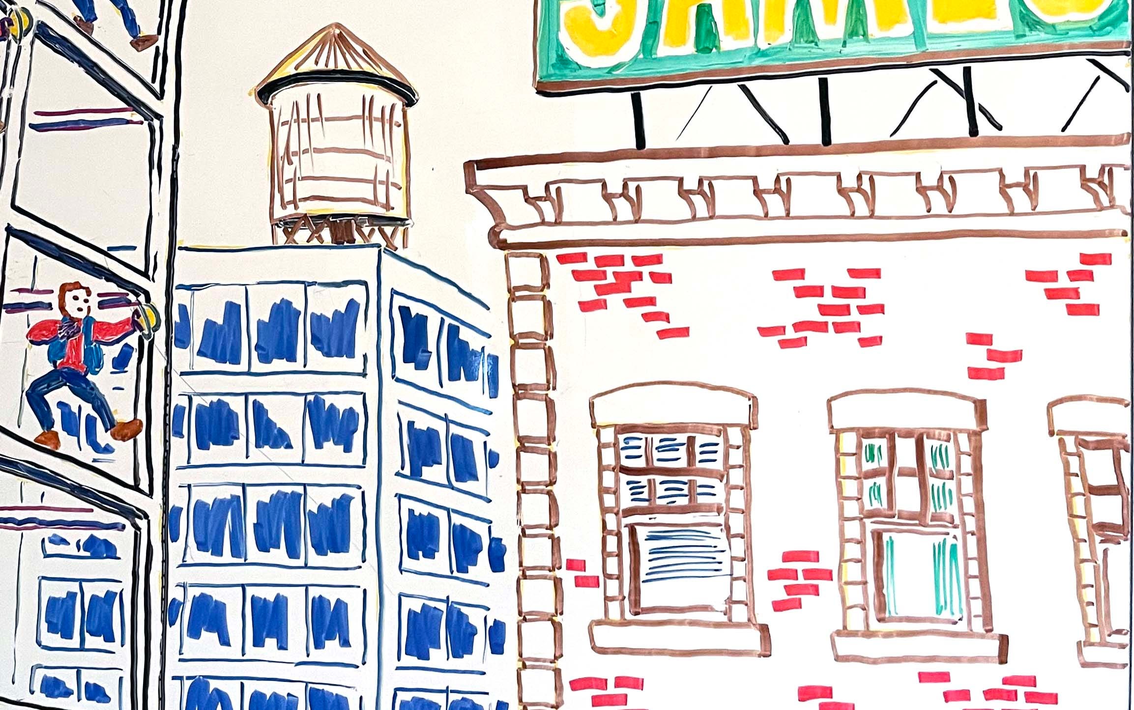
The “Upper East Side” whiteboard was important in the development of my craft, because it’s the one that finally made me decide that I was never going to do such an involved composition improvisationally, with no preliminary sketching on paper. Every complex design after this, I did sketches!
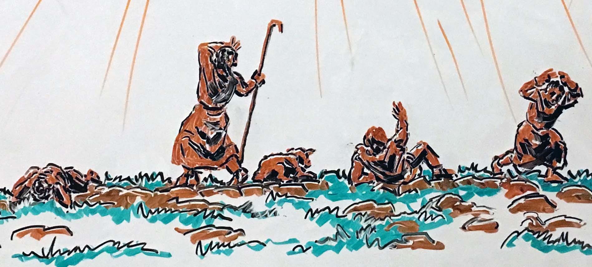
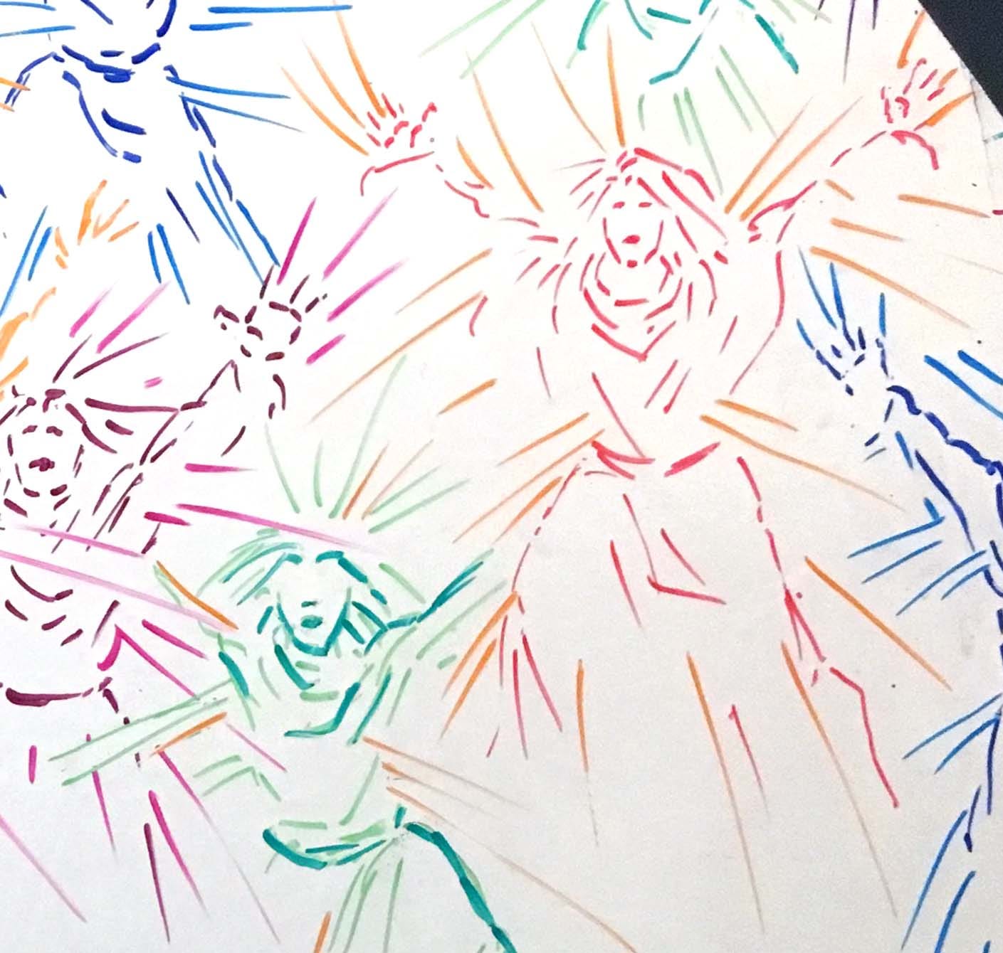
Fall on your knees! O hear the angel voices!
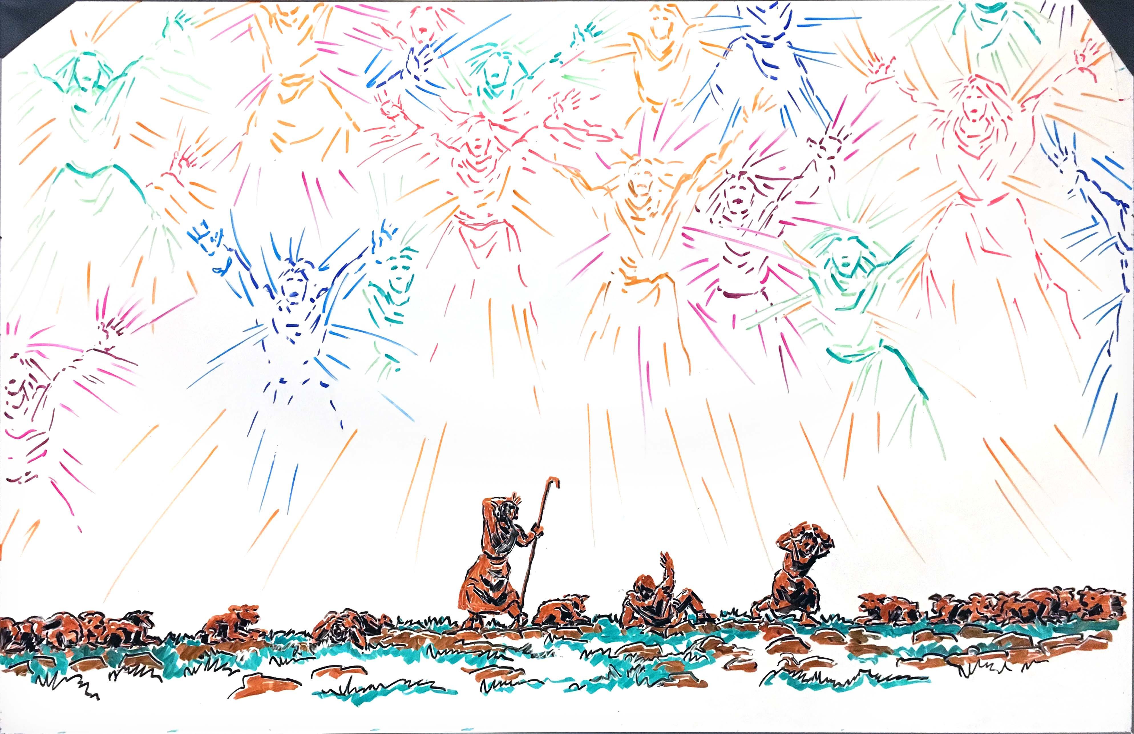
This is a very early, experimental effort from 2017—at the time, the most elaborate whiteboard design I had done. When our middle daughter Anna, then 14, challenged me to draw something for Christmas, I didn’t want another Nativity (our house is full of crèches at Christmastime). I was also partly inspired by the 14-year-old’s own earlier whiteboard illustration of a cutesy cherub—with a note that, if angels really looked like that, they wouldn’t have to keep saying “Do not fear.”
I wanted to draw shepherds heralded by a genuinely overwhelming angelic vision. I’m still pleased with the panicked body language of my four shepherds; I was unhappily less successful at making the sheep clearly sheep and not dogs.
The angels are, I think, suggestively intimidating. I think I would be afraid.
Army Anna
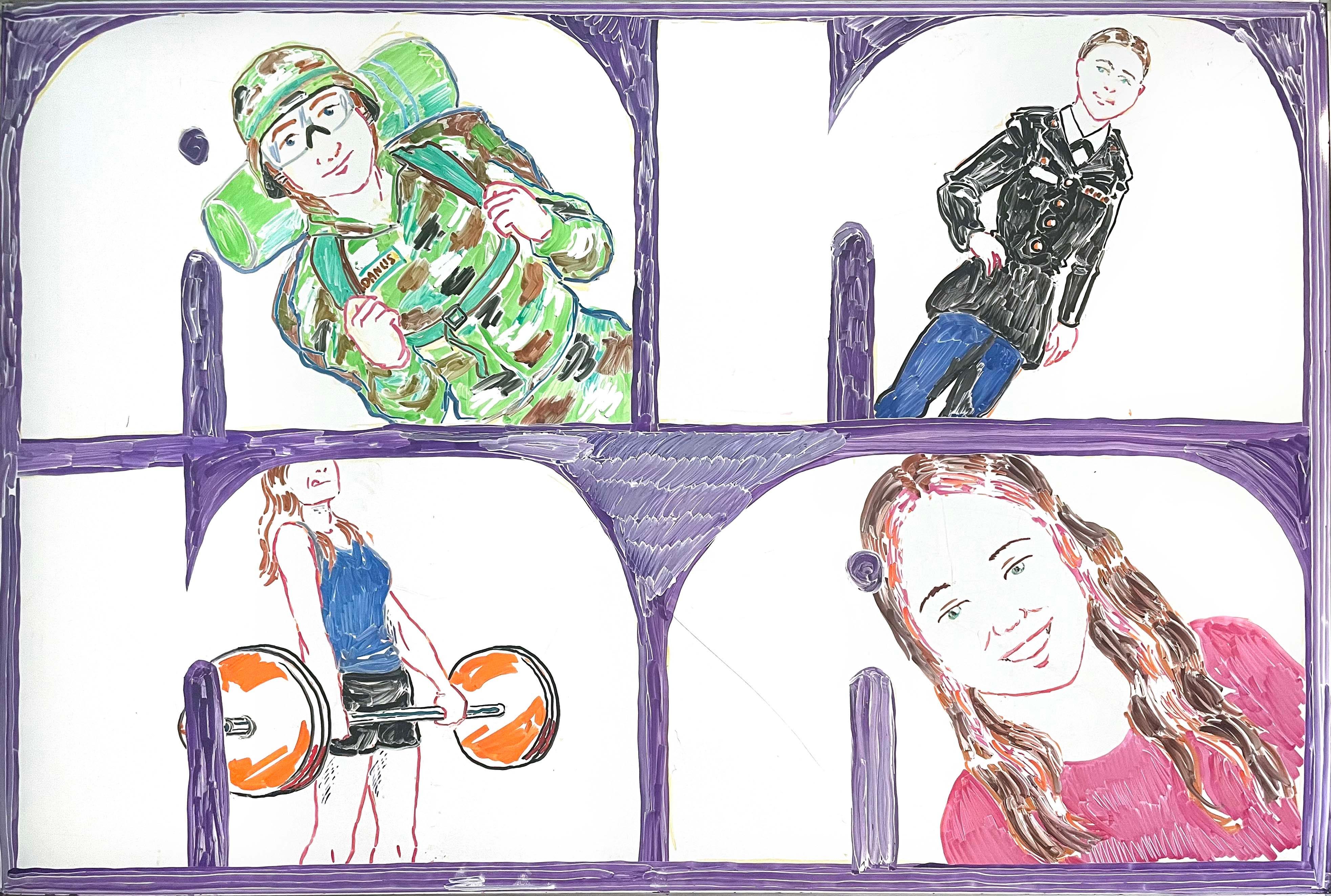
Anna is now an ROTC cadet as an Army nursing student (in fact, right now she’s at Advanced Camp at Fort Knox, rapelling down towers and crawling through mud and all that stuff). For a recent birthday whiteboard, I drew four images in the letters of her name: in combat fatigues with a rucksack; in dress uniform for some special occasion; doing deadlifts; and with pink highlights in her hair, highlighting that the Army doesn’t own her all the time; since she can’t use non-natural hair colors during the school year, she does this when she comes home for the summer!
Angel/Vampire Anna
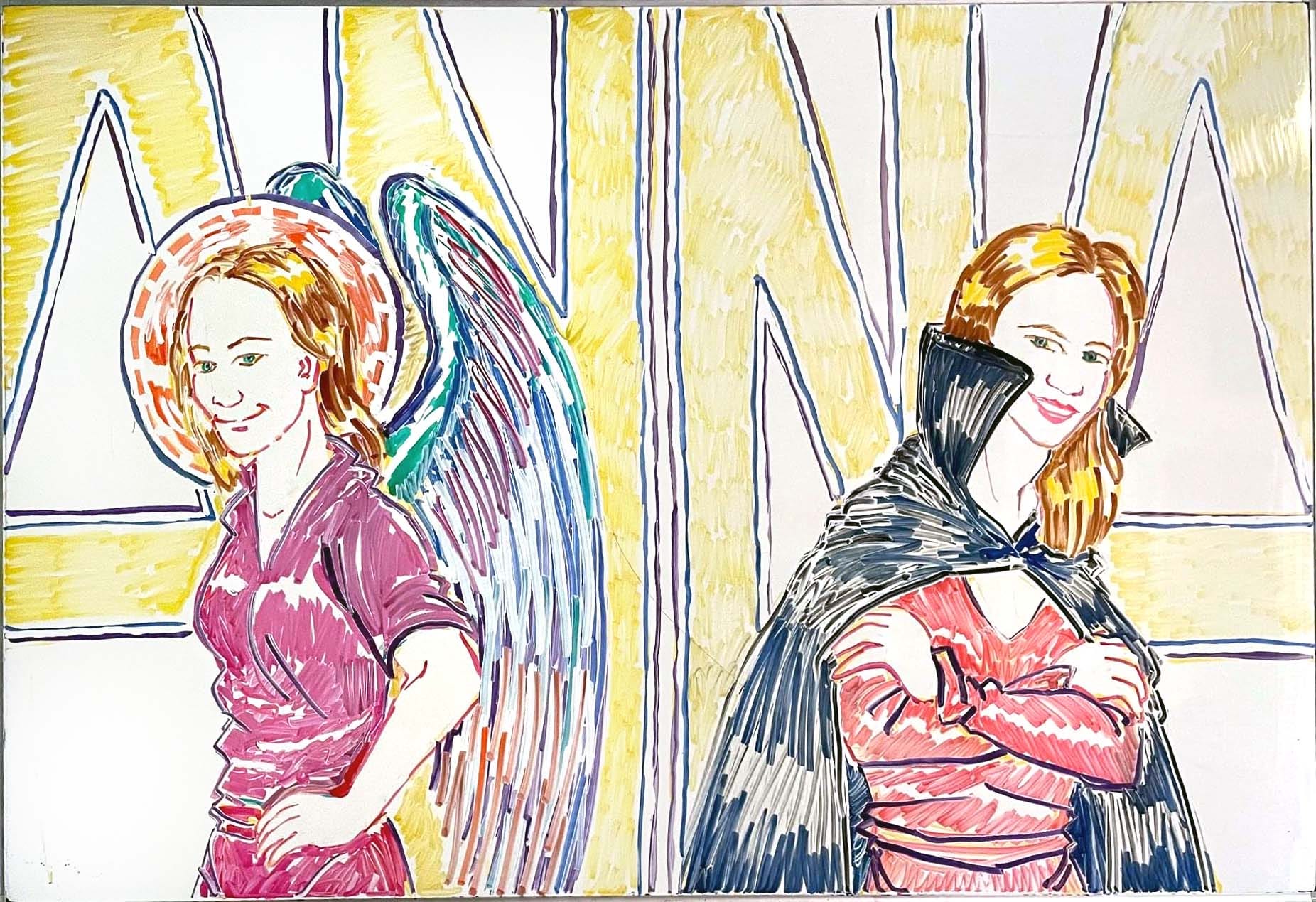
A couple of years earlier, when Anna was first going into nursing studies and working as a phlebotomist, I did this diptych portraying her both as a ministering angel in scrubs, representing her nursing ambitions, and a vampire, representing her phlebotomy work. (Phlebotomist/Vampire jokes were common in our house at the time, especially since Anna, like her father, is a big fan of the vampire mythos.) It’s not my best work, and Angel Anna is more successful than Vampire Anna, but the concept was a good one.
The gentle art of folding clothes while people are still in them
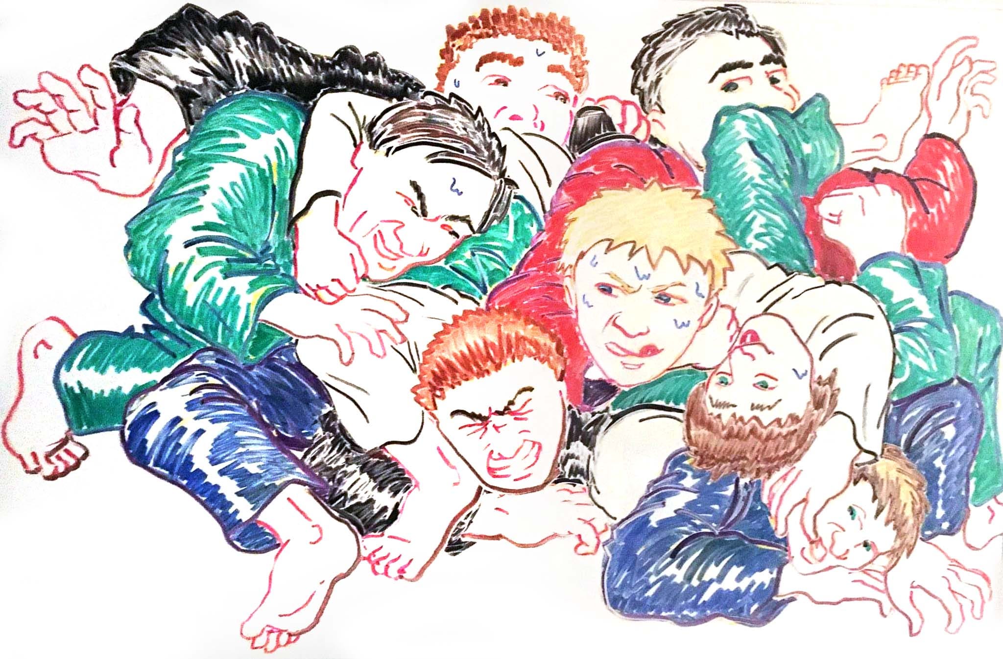
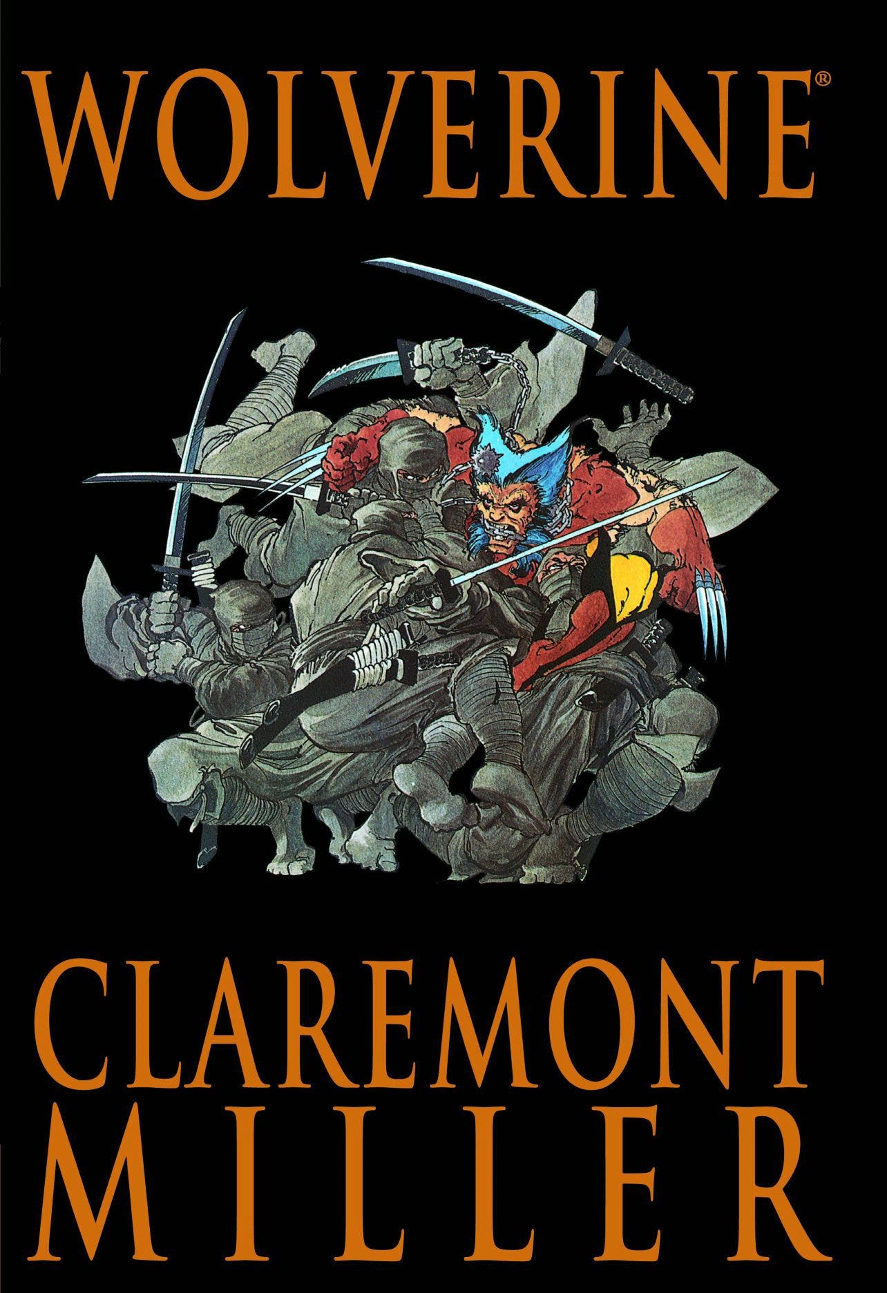
All of our boys do Brazilian jiu-jitsu. A few years ago, when Nathan started, he was going two to three times a week, and when his birthday rolled around he had been doing it for a few months. I put him in the white gi and made the other gis different colors to aid legibility in a complex composition. I gave Nathan anime hair, but I’m not much for anime stylings, so the other features are typical of my style. I created this composition improvisationally, which now seems insane to me! (I think it was after doing this one that I first thought, “I should probably do preliminary sketches for these”—but it wasn’t until after the “Lower East Side Story” design that I actually resolved never to work without a plan again.) The germ of the idea for this one came from the Wolverine graphic novel image below, although obviously I didn’t use it for reference or anything.
OS!
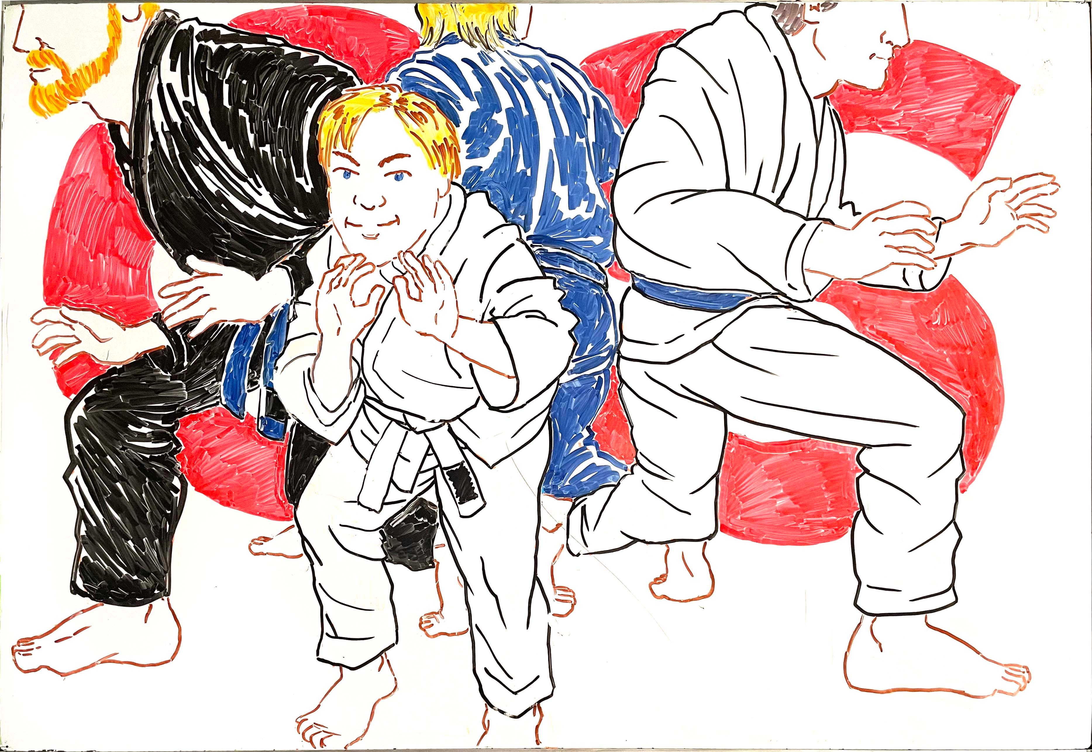
When Matthew, the youngest, officially started BJJ, his older brothers were all blue belts (the oldest is now a purple belt). Unlike the improvised Nathan melee design, this hero-circle composition I planned carefully, highlighting Matthew while making his brothers, who indubitably have his back, recognizable but slightly anonymous (no eyes!). The red os (a phatic term of Japanese origin, also spelled oss or osu, used in martial-arts circles as a marker of respect) as a unifying design element was an afterthought (possibly inspired by the red “25” in the next image, which came first, and was planned that way).
Quarter century
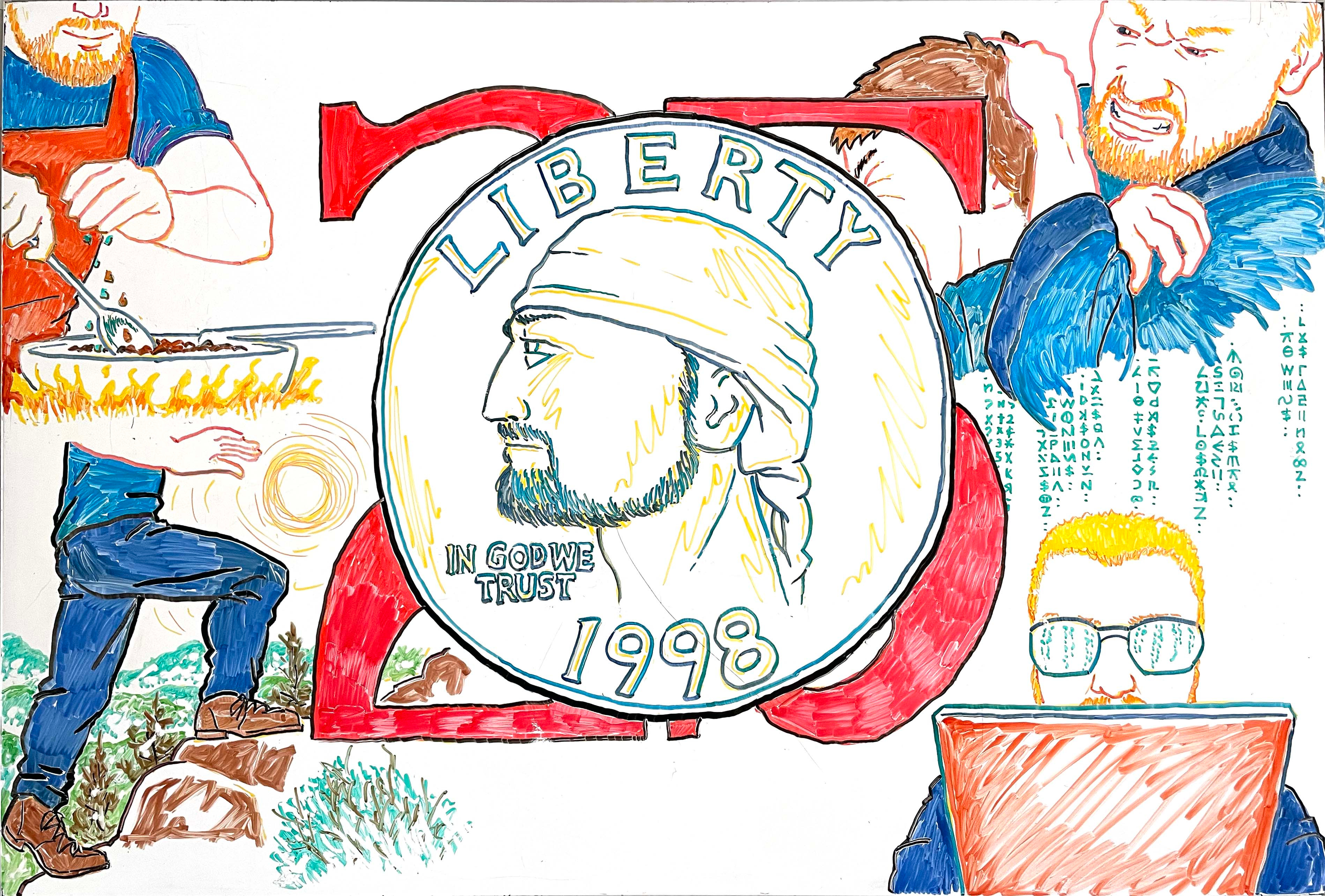
When David, the oldest boy, turned the big 2-5, I did this design celebrating five things he enjoys: cooking, BJJ, hiking, esoteric computer stuff, and wearing blue. I liked how the do-rag in the central image suggests the look of George Washington’s wig on a real quarter.
Covid Easter
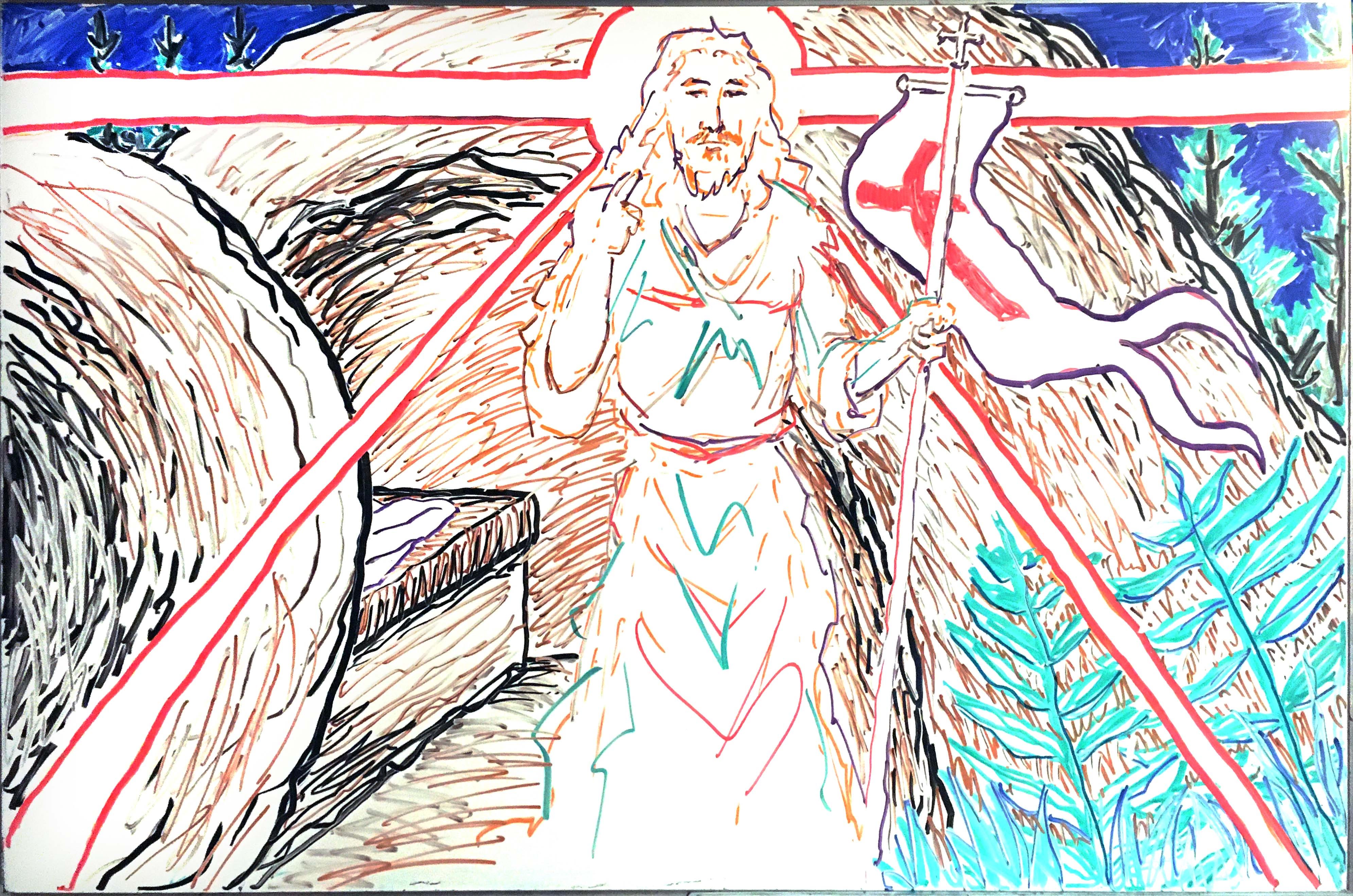
2020 was the year of the Lent that never ended: churches closed, no Holy Week or Paschal Triduum liturgies; nothing for a deacon to do. We watched the liturgies online, of course, and we prayed and read the scriptures and sang hymns, and there was joy in that. Catie adapted a line from Dr. Seuss and wrote it on the whiteboard:
Covid hadn’t stopped Easter from coming! It came!
Somehow or other, it came just the same!
On Easter Sunday, I drew this depiction of the resurrection of Jesus. I drew it improvisionally, with no planning, and it’s not a great design. (Among other things, I’m chagrined to see that even though I knew better at that point, I still reflexively fell back on some of the conventions from my old “Death’s bad day” college Easter cartoon: a boulder instead of a disc-shaped stone covering the entrance to the tomb, and even a tabletop-like stone slab on top of the burial bench. At least I didn’t give the sepulchre a Flintstones-style roof this time!
I do like the idea of the sketchy strokes in non-representational color depicting the resurrected Jesus.

Someday I’ll take another shot at this idea and see if I can execute it any better with planning!
Sister artists in creative dialogue
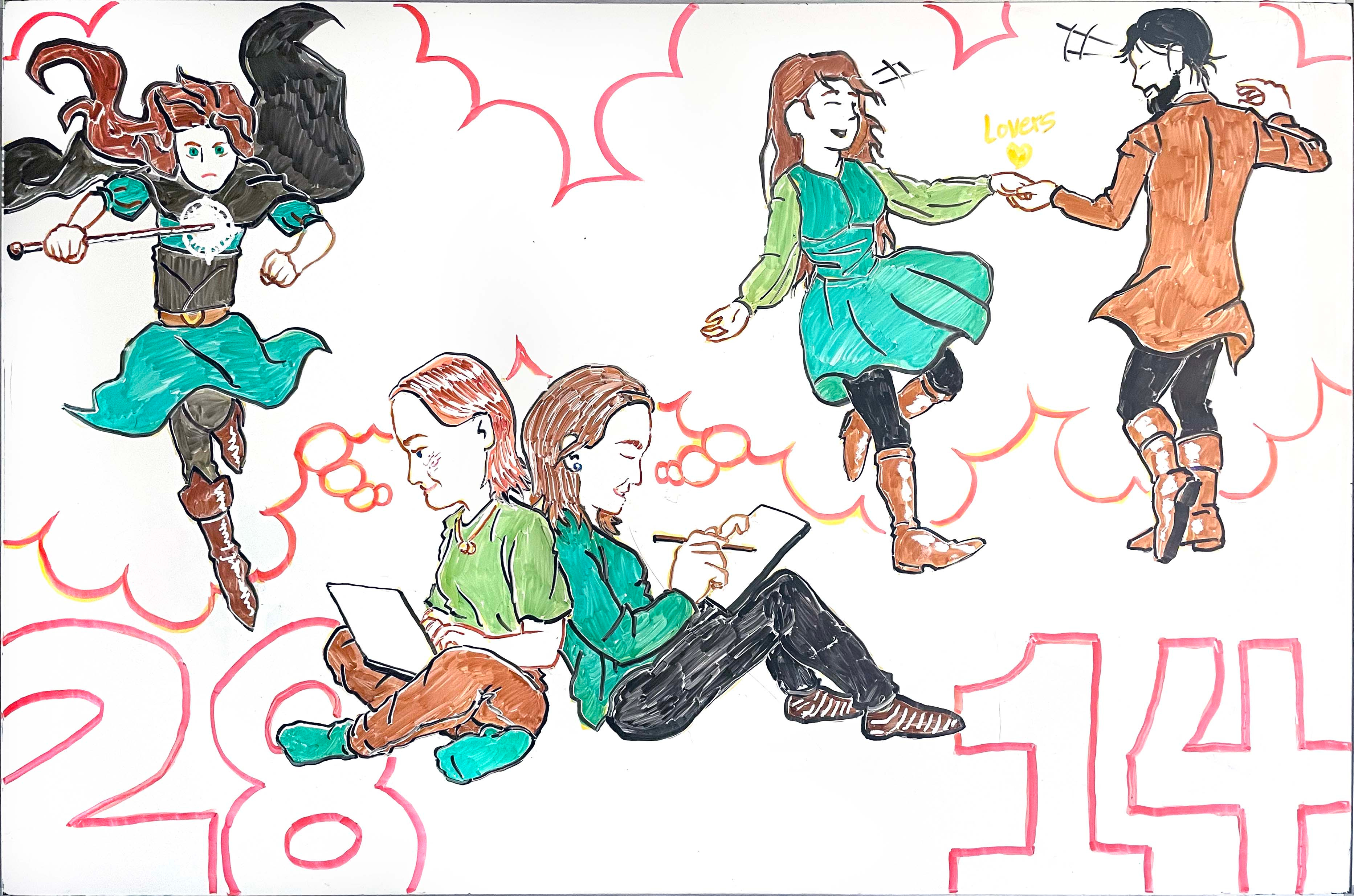
This is a special one to me: Like the Coraline design, it’s a joint birthday whiteboard for our oldest and youngest daughters. Because they’re so different, it’s hard to find meaningful themes that include them both—but the year that Sarah was exactly twice as old as Catie, I came up with a great idea: Catie has become a proficient digital artist, and she’s done drawings representing characters from Sarah’s latest novel, The Living Fiddle (read a free sample!). This whiteboard celebrates the overlap of their creative efforts, with Sarah on her laptop, Catie on her digital tablet, and a shared thought balloon featuring the characters created by Sarah as visually conceived by Catie. This design was carefully planned beforehand, and I’m particularly pleased with the consistent color scheme, drawn from Catie’s designs. (The 28/14 was an afterthought.)
Planet Matthew
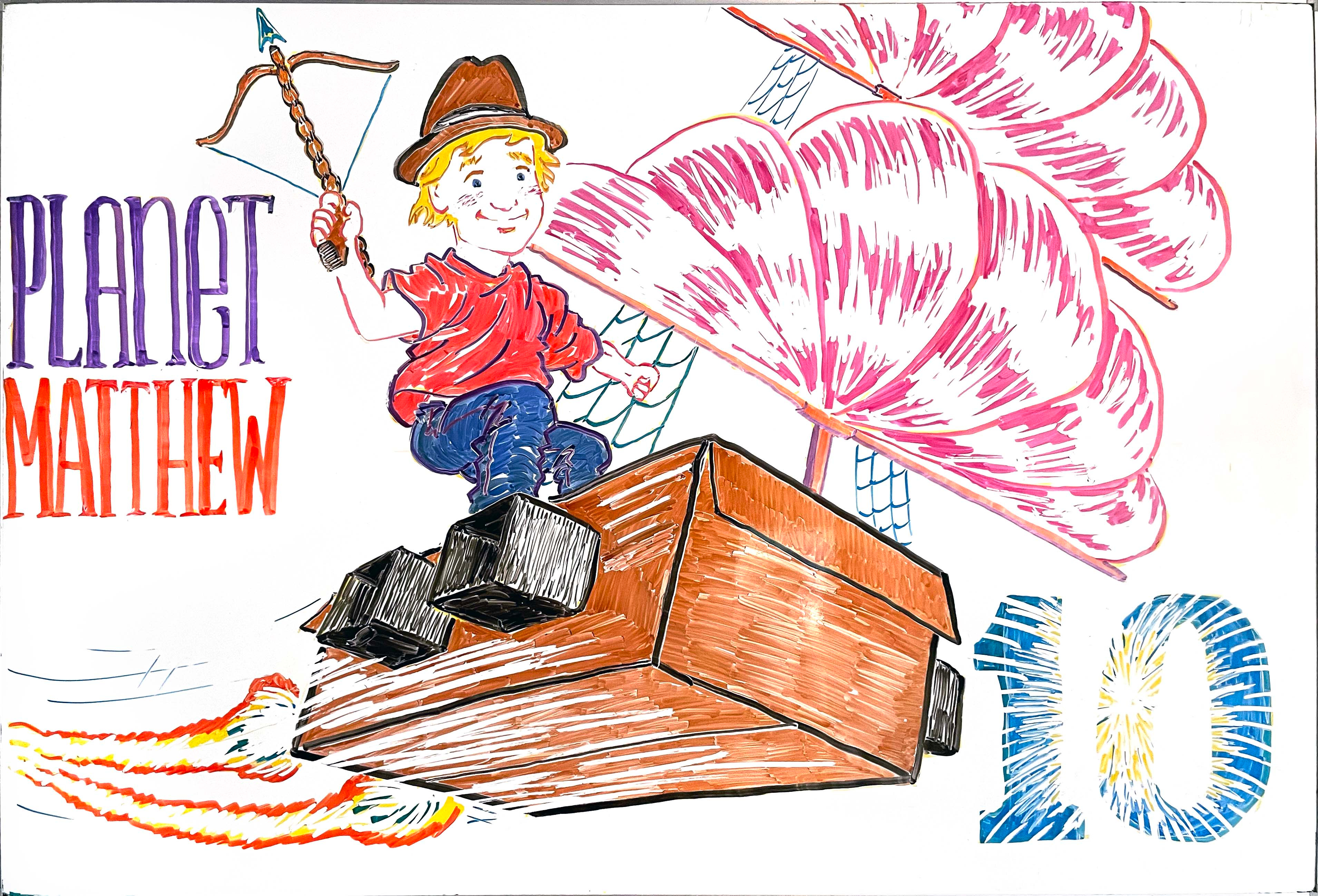
This whiteboard (created before Matthew began BJJ) brings together a number of things. For many years Matthew has had a penchant for industrious play involving cardboard boxes. The original inspiration, I think, was Calvin’s multi-purpose cardboard box in Calvin & Hobbes, but Matthew is more interested in physical transformation than pure imagination: In this case he turned his box into a pirate ship, complete with cannons made of old wine boxes and a mast with the Jolly Roger hiding behind the Union Jack. Felicitously for my purposes, this project converged nicely with the tallships-in-space milieu of his birthday movie pick, Treasure Planet. The crossbow he also made (it was purely decorative, not functional). I don’t know why he liked that fedora, but he did.
This was an important piece for my craft, because here is where I really learned to use Q-tips for special effects, like the texture of the sails, the white motion streaks on the body of the ship, and the explosive effect in the “10.” (The fireworks effect in the “Happy 4th” image at the top was pioneered here.)
Strike
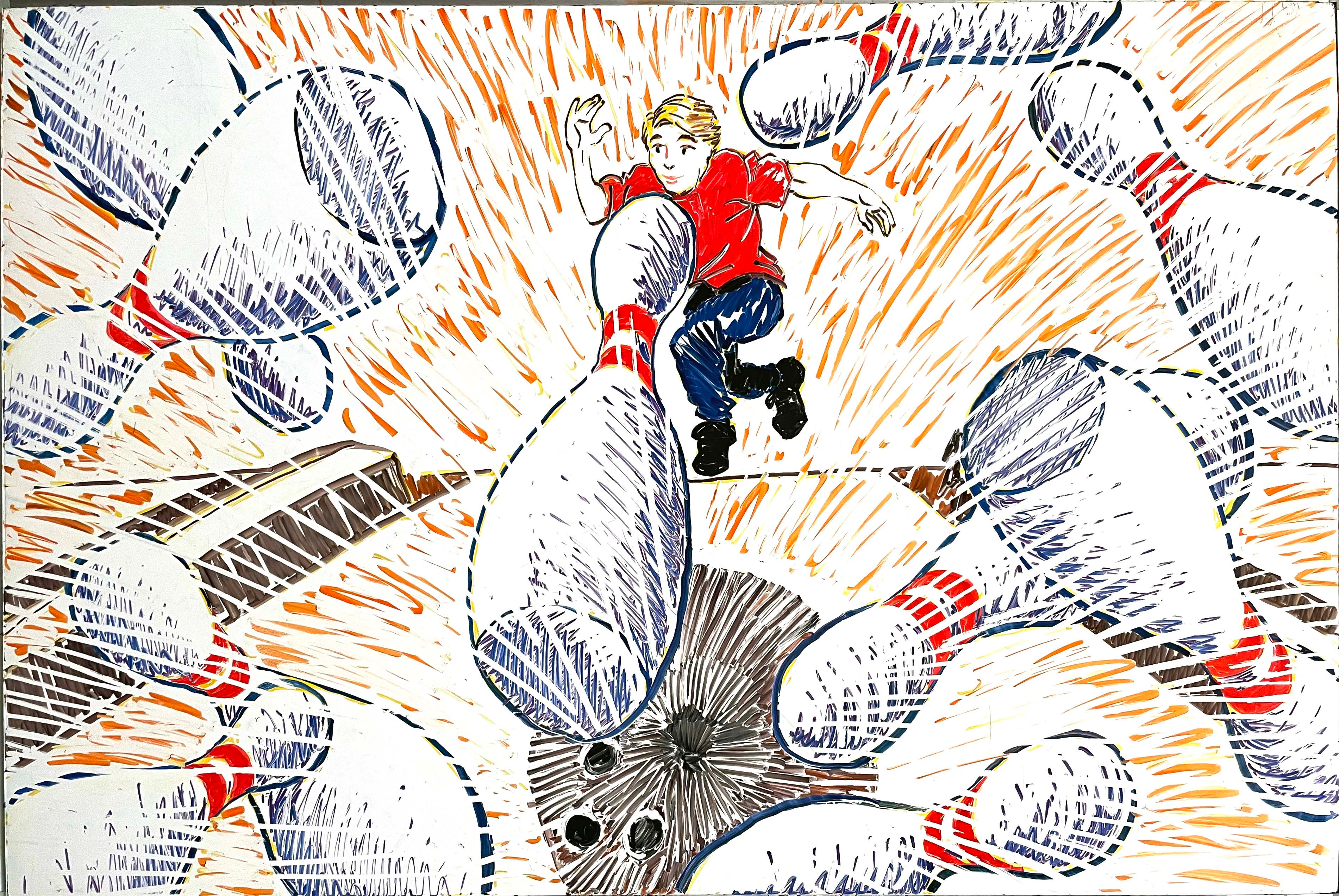
We’ve never been a bowling family, but for a recent birthday Nathan wanted to go bowling, and it was a blast. I drew this birthday whiteboard before the event. The Q-tip usage that I pioneered with the “Planet Matthew” design was obviously even more crucial here. An art-school friend perceptively remarked that the kineticism of the design is reminiscent of anime. It’s also, I think, a little bit Doctor Seuss.
Watership Down
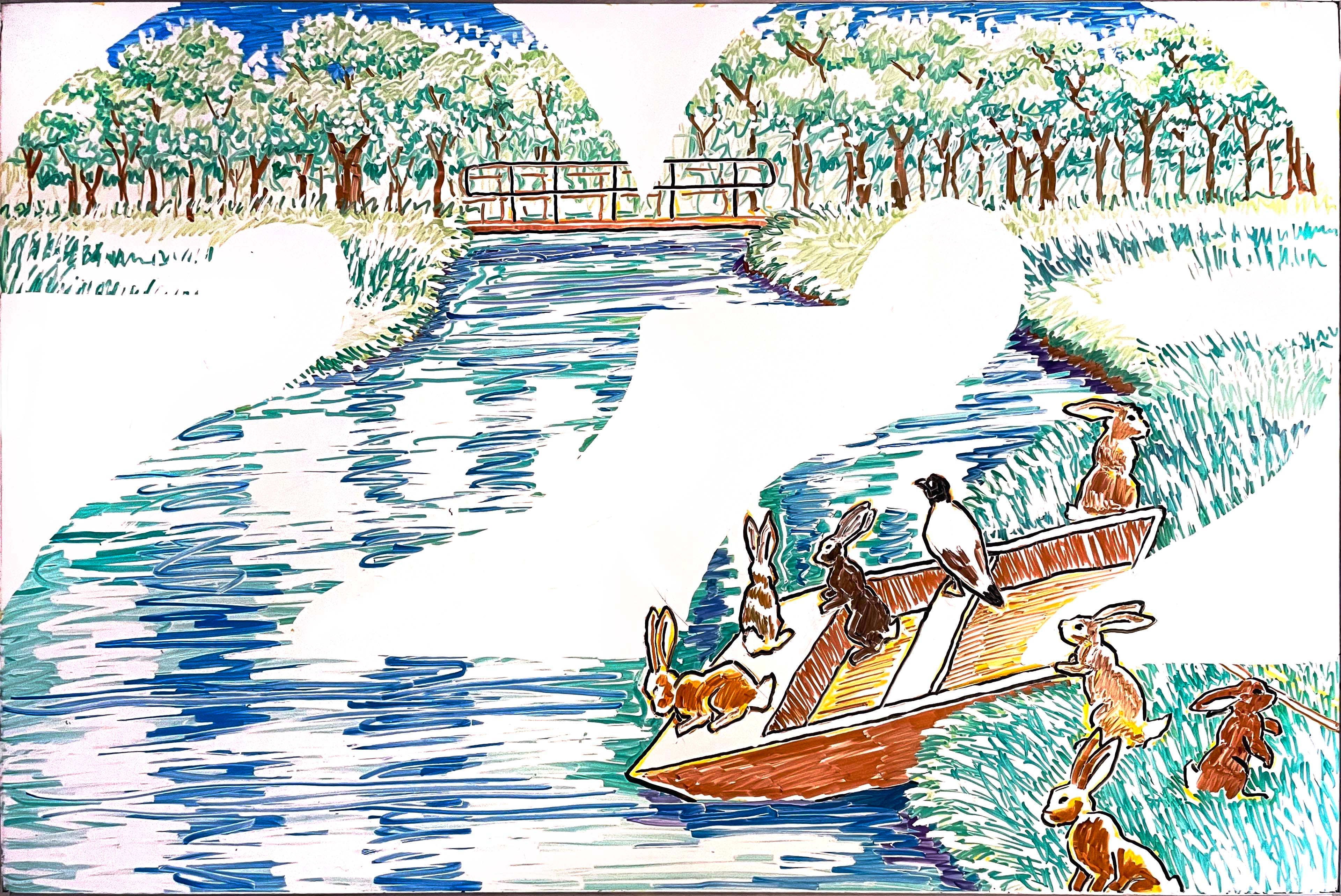
Like James’s Tom Bombadil “20” whiteboard (below), this one, done for James on his 22nd birthday around the time he was reading and falling in love with Richard Adams’s extraordinary Watership Down, uses negative space to form the numerals of his age out of the picture. Unlike the Bombadil design, this one was carefully planned to include the most important parts of the image. I like the way a couple of the rabbits cross the boundary line of the numbers.
The model for my design was
’s gorgeous cover illustration for the graphic novel adaptation of Watership Down on which he collaborated with James Sturm. Of course dry-erase markers can’t do justice to the beauty of Joe’s illustration, but I did my best. Thank you, Joe!
James is 20, Tom is oldest

I already posted this one in the Coraline piece, but, for comparison purposes with the Watership Down “22” design, here it is again. James is probably our family’s biggest Tolkien fan, and he asked me for a Tom Bombadil design, and this is what I came up with. In this case, the idea of using negative space to form a “20” out of the image was partly a way of hiding Bombadil’s full face, making him more mysterious and iconic. Very unhappily, I had no yellow at the time—yellow dry-erase markers are oddly hard to come by—so even though Tom’s boots are canonically yellow, I had to settle for orange. (Of course his jacket is bright blue!) This was an improvisational design, and there are details I would do differently if I were doing it over with a plan!
There are more, of course, but these are the ones I think most warrant sharing here. I hope you enjoyed this glimpse into life at the Grey Havens!
See more SDG art >
Related:
A ‘Coraline’ birthday

For decades, for our kids’ birthdays, I’ve used our household dry-erase whiteboard to celebrate the birthday child and their current interests or occupations. As these things are wont to do, this tradition started relatively simply, but over the years the efforts have become increasingly ambitious, elaborate, and time-consuming!
Beautiful stuff! No notes.
I love so much of your artwork here, and your explanations of how you developed your craft. Also, my compliments to Catie on her Covid/Easter rhyme!